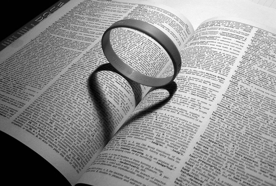
Inside, Outside and In Between
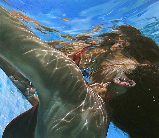
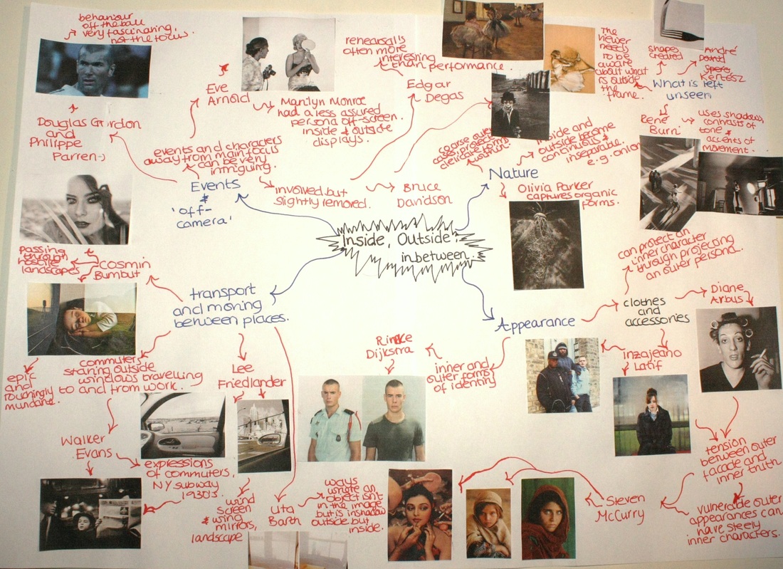
Brainstorm
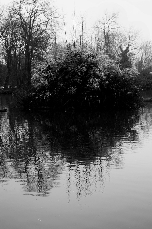
Firstly, to begin the exam theme 'Inside, Outside and In Between,' I have decided to create both a written brainstorm and a visual brainstorm, both of which include a wide variety of photographers, separate ideas and aspects from the exam paper. The aim of this task was to trigger my thinking about which areas I may consider focusing on for the exam theme and how I shall develop my ideas further towards a final outcome. (click picture to enlarge)


Catherine Yass: Research and Analysis
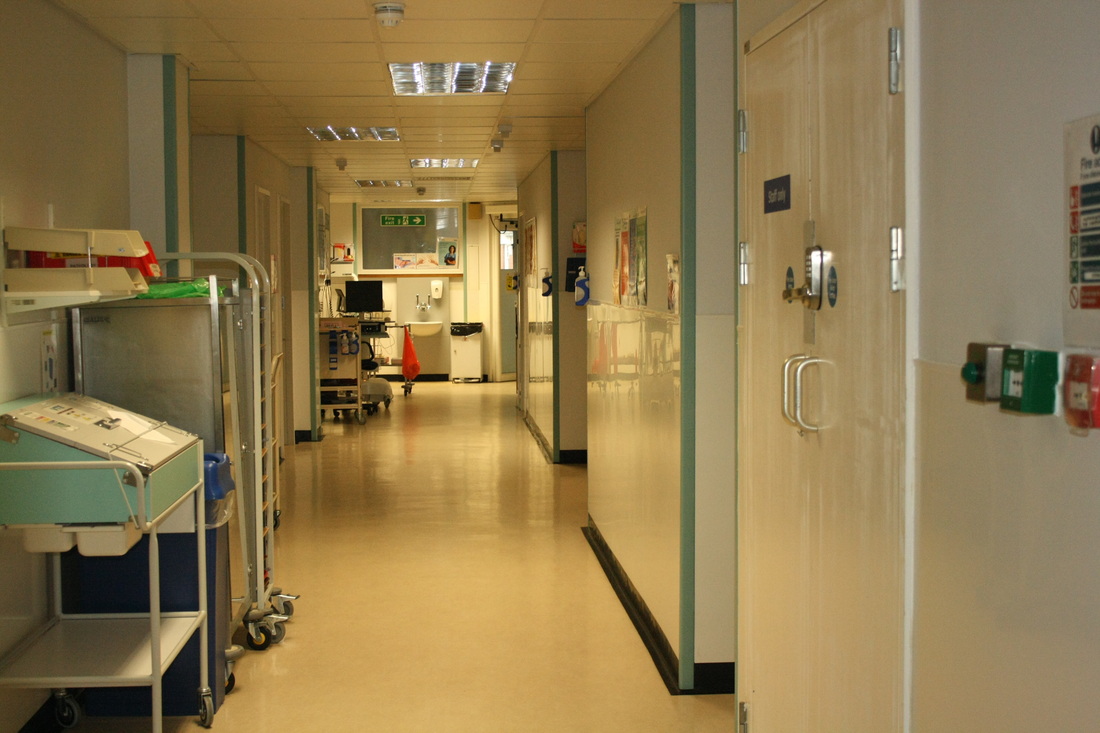
Catherine Yass is an English artist and photographer who is often noticed for her brightly coloured photographic and film based work. Yass manipulates her subject matter in the images by overlaying the negative and the positive from photographs she has taken and then releases the resultant images as light boxes, prints and films. Yass' famous collection named 'corridors' is a series of eight photographic transparencies displayed in light boxes. The images are taken of the interior spaces in a hospital and consist mainly of luminous greens, blues and yellows as a result of Yass' manipulation of the film. In the image above there is a long corridor which gets narrower deeper into the photograph due to the angle which it has been taken at. The main features within the photograph are windows, doors and the walls within the hospital, these all appear bare and empty. The photographs are in sharp focus, but only at the foreground of the image at the level of the corridor walls, and have been taken with a shallow depth of field. This has resulted in more abstract forms in the areas further away from the camera. This is the center where there is an intense blue glow. The blue light here is similar to a shade of blue called, 'Chartres Blue' which is found in many church stained glass windows which has developed since the 12th century, this has become a key feature of Yass' work and can be seen clearly in the above photograph.
Her technique for making images involves taking two photographs of her subject and superimposing them. One is a 'positive' image, the normal form of a photographic image, and the other is a 'negative' image, where light and dark are inverted as on the negative of a photographic print. The photographs are taken within a few seconds of each other. Yass has explained:
'The negative image makes bright areas blue, so bright or transparent areas get blocked by the blue. The final picture is produced by overlaying the positive and blue negative images and printing from that. I think of the space between positive and negative images as a gap.
The reason behind, 'Corridors' began when Yass took portraits of the hospitals inmates, of individuals with mental health problems and their stories behind their situation. She was interested in exploring the relationship between personalities which were being projected and the environments against which they were set. She began by looking at photographic research into mental health undertaken at the hospital in the mid-nineteenth century by a local doctor, a Dr Diamond. At that time medical practitioners in the field of mental health were using photography as a tool to classify mental illness according to its physical manifestations. Diamond's portraits of his patients labelled them under headings of their perceived disability. To subvert this, Yass made six portraits of anonymous hospital inmates and staff without visible indication of their status. The photographs used in 'Corridors' were intended as backgrounds to these portraits. Yass became interested in the empty spaces as images in and of themselves, perceiving them as even more disorientating to the viewer without their intended subjects. She uses light boxes to enhance this effect. She has stated:
'The work is not only about the image but also about the light boxes in a physical space. This produces another doubling or turning as the viewer switches between the space of the image and the space they're in. There is a disorientation as they are caught in the gap between them.'
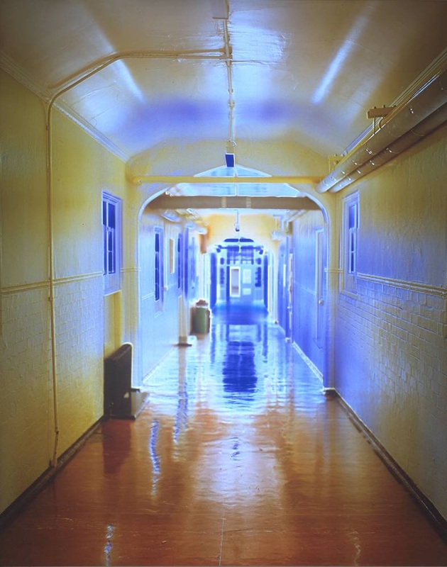
'Corridors' by Catherine Yass (1994)
Digital Response: Corridors by Catherine Yass
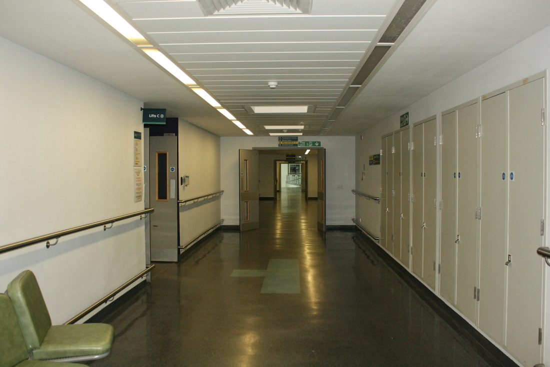
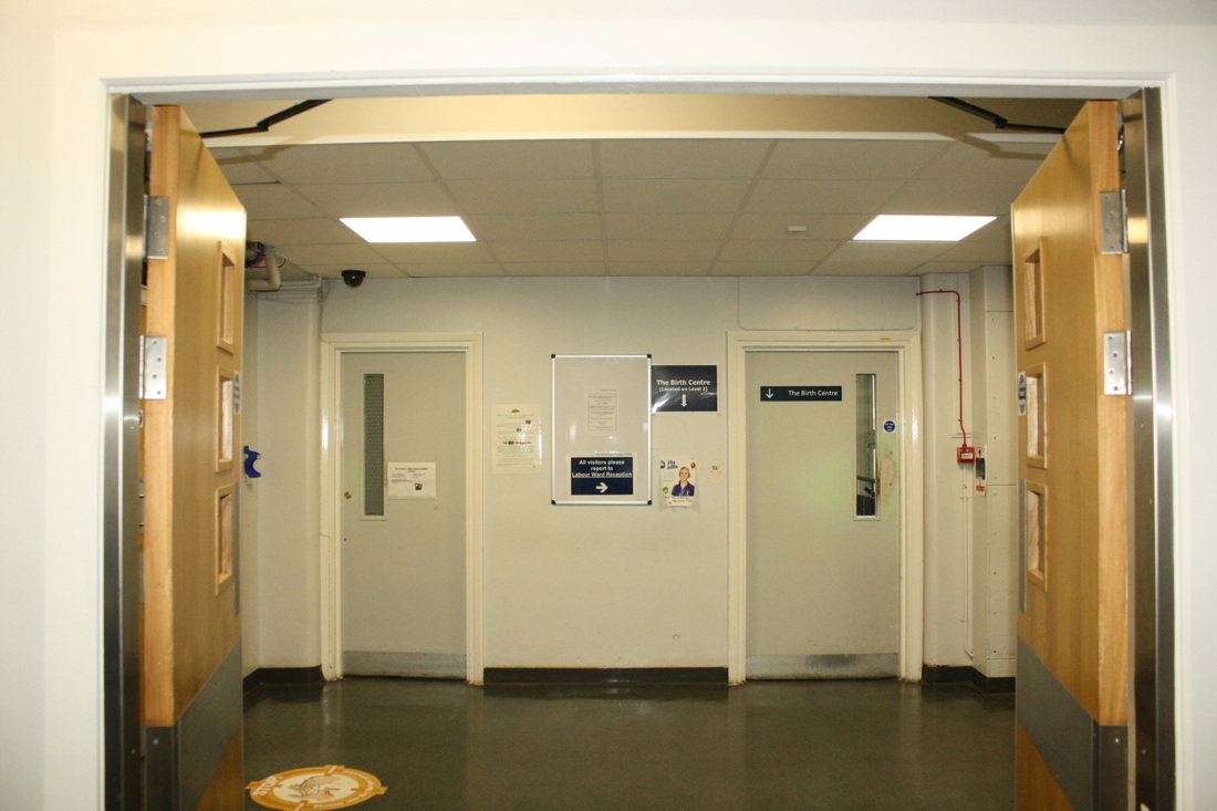
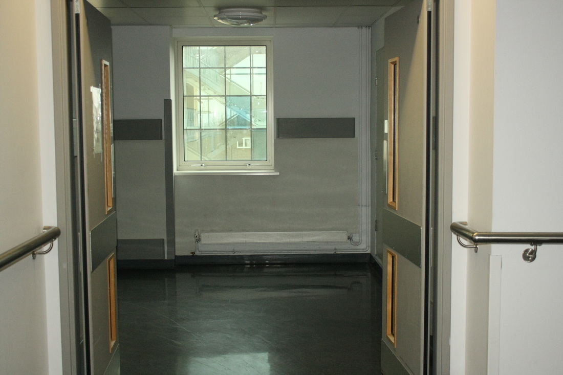
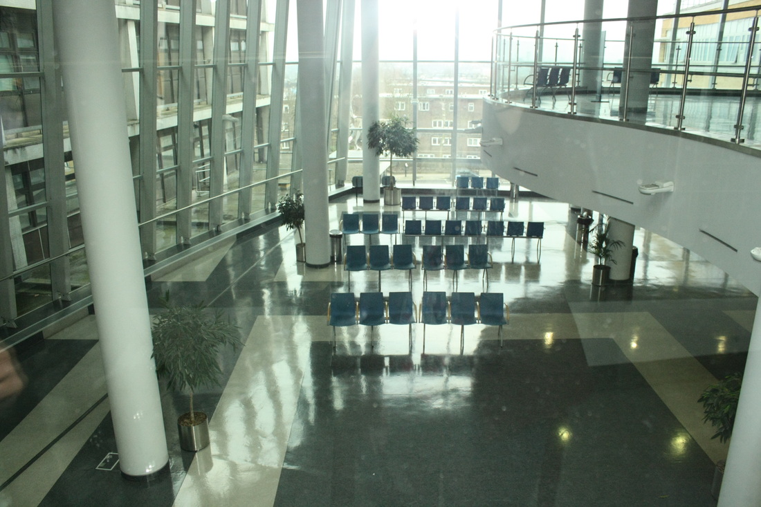
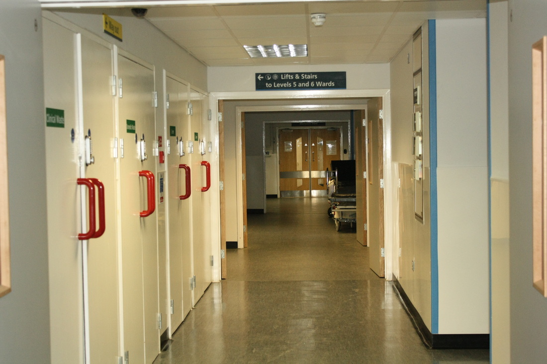
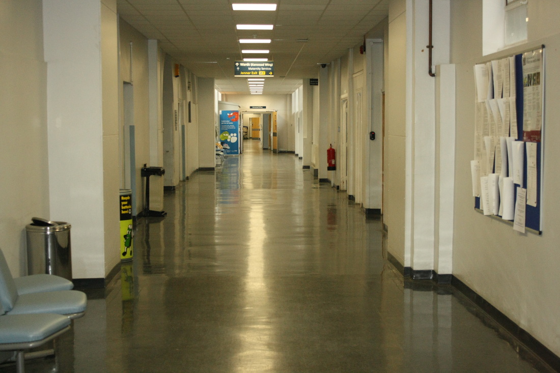
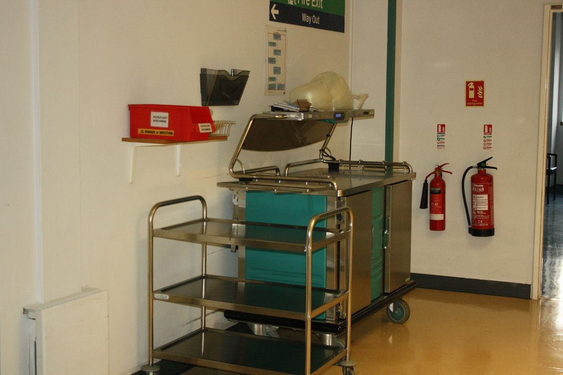
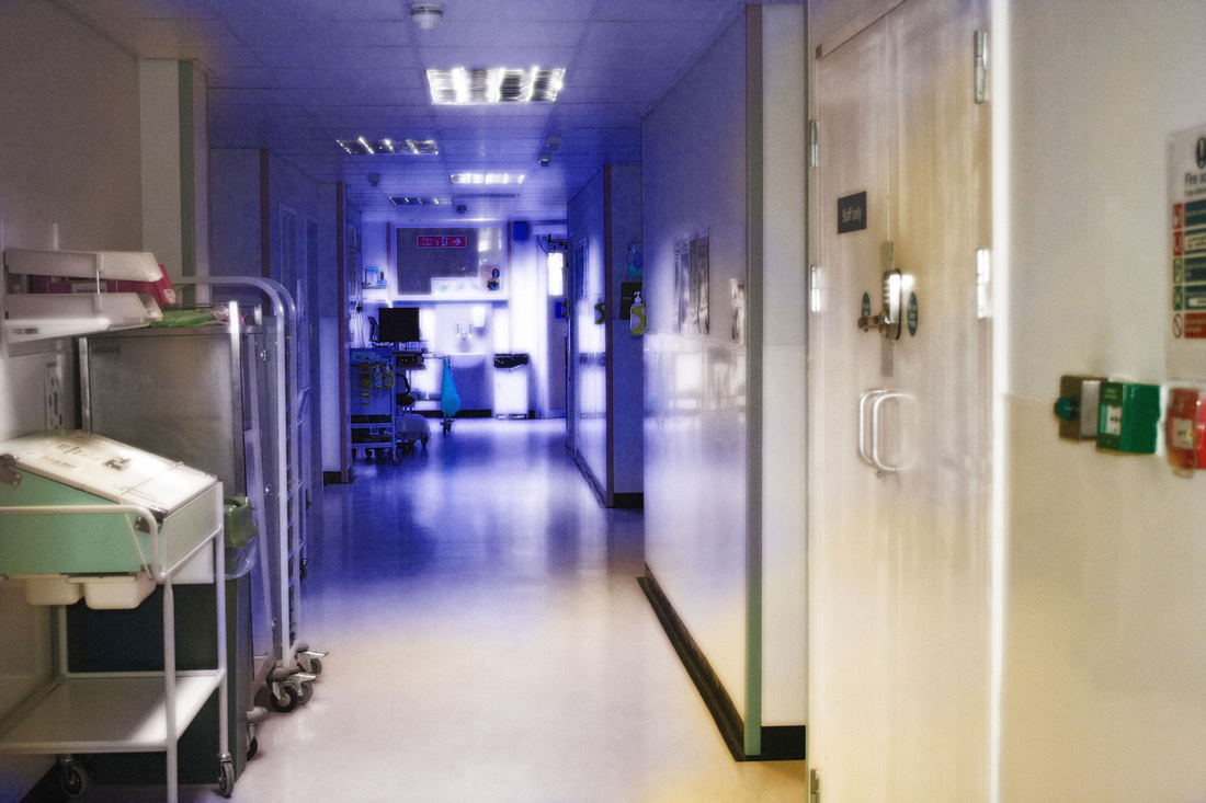
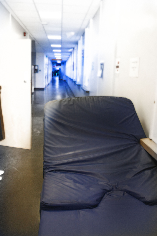
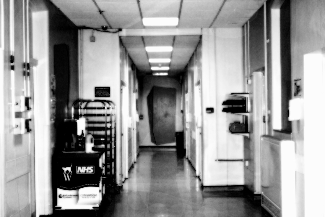
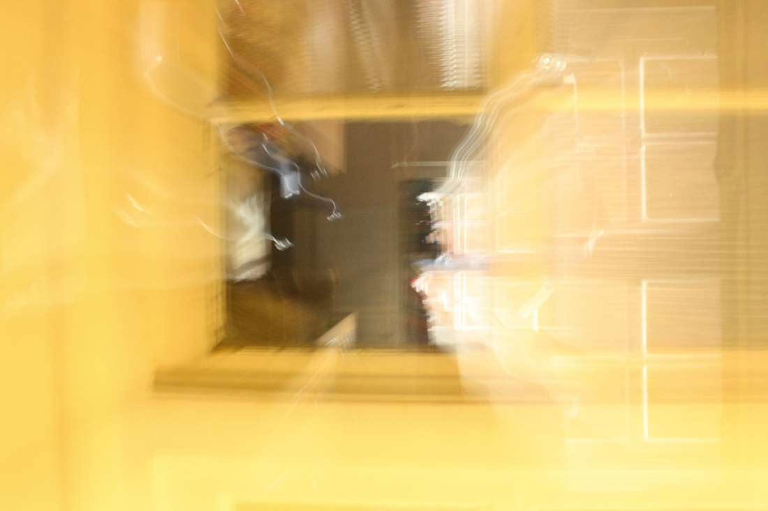
For my first collection of images in the topic, 'Inside, Outside and In Between,' I photographed a digital response to Catherine Yass' ''Corridors.' To do this I photographed a hospitals doorways, lifts, empty chairs and corridors to try and capture the emptiness and bareness of a long narrowing corridor. A key factor within Yass' collection was the bright luminous light which she manipulated to create a glowing blue effect.The reason as to why I took photographs of chairs and lifts as well is because they had much light reflected on them due to the huge windows behind, they also were completely bare and thus I believe this has given me a diverse, wide variety of images. It became of great importance to me that when I photographed the corridors I took the photograph from an angle which made the corridor appear both deeper and narrowed as you look at it: this was an important technique in Yass' work. Additionally, I shot the images when the hospital was very empty as the corridors were bare and glum: this is clearly reflected within my digital response.Then, to capture the blue effect which Yass used I edited my images on photoshop and adjusted this light artificially on them. Although Yass did this manually I believe the colour could be adjusted to the exact tone which I wanted - it seemed a more reliable option. I also added a glow effect to my image as it can be seen that in Yass' collection the light is very bright and overwhelming where the doors and windows are - I believe that the glow created this effect to a high standard. My images relate to the 'Inside, Outside and In Between' theme through the use of doors and the idea of them leading to another world, the blue effect emphasises this point as it looks as though the blue shimmer is a gateway to somewhere else, thus moving 'in between' two places.
What went well: I think these images were very successful in response to Catherine Yass' 'Corridors' collection. The long lengths of some of the corridors highlighted in a blue look as though they are leading to a different 'outside' world. It created a surreal effect and with the glow which I created on Photoshop the images seem slightly mystifying and intriguing, it is as if the space before the blue is another world to that of the blue space. Also because the blue effect leads to down a corridor it suggests a journey to some extent - moving in between places. I also edited a few of the pictures into black and white or a pink colour to try out different effects, whilst the blue creates a more mysterious effect I believe that the black and white makes the image seem slightly creepy and disturbing due to its dark tones. I think this variation is good as it allows me to compare which techniques work better than others.
Even better if: To improve this set I could have gone into greater depth with understanding what went in on inside the hospital. For example, in Yass' collection she explored the stories behind each inmates situation - those with a mental health problem. However, getting access to this type of information would be difficult due to confidentiality within the hospital.
Original Images
Edited Images

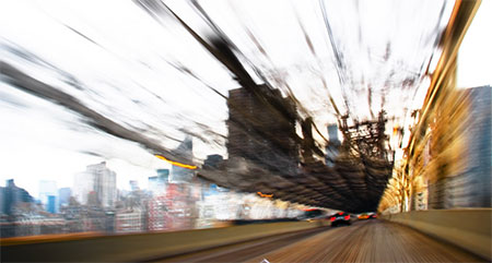
Zoom Blur: Dominic Harris
Dominic Harris is a South East London based photographer who completed a series named, 'Journey' whereby he took images of landscapes which are all shot from trains in different cities and countries using a long exposure.
- Journey 1 is from Rome to Florence, Italy.
- Journey 2 is from London to Brighton, UK.
- Journey 3 is from Manhattan to Long Island, USA.
- Journey 4 is from Calcutta to Cochin, India.
Each journey's images has a distinctive colour and style which appears to represent the enivornment which it was taken in - from the very abstract Italian series to the colourful and expressive Indian pieces. As Harris moves from place to place by traine uses a long exposure which explores time. The series is a memory of journey and the local landscape. The long exposure technique has created a set of successful images which smearobjects into a single flow, some focus of a single subject whilst others are of a broader landscape. Harris is moving 'in between' places, and also the long exposure has the effect of creating an idea of a life within two separate worlds, like some sort of parallel universe, perhaps.
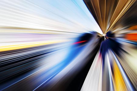
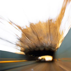
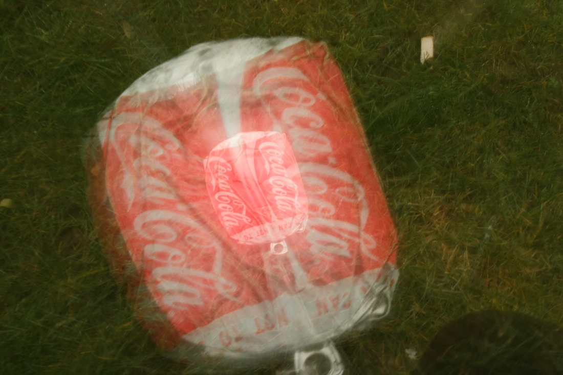
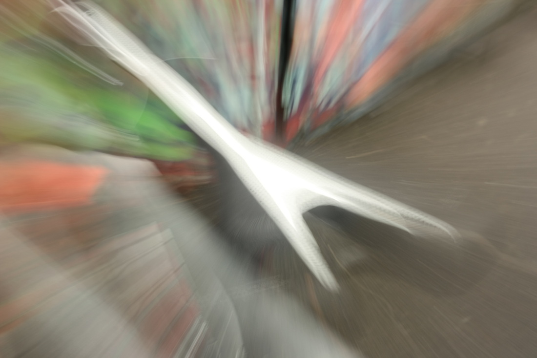
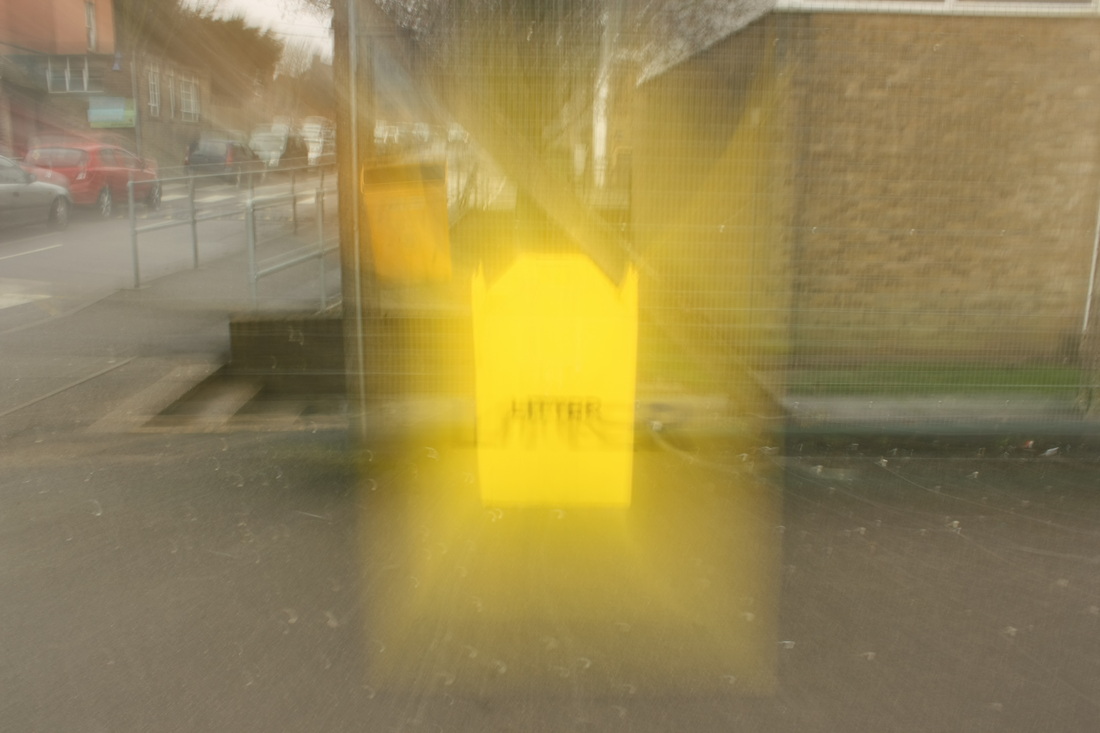
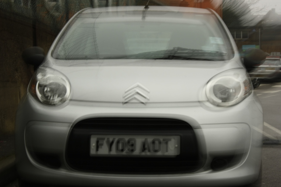
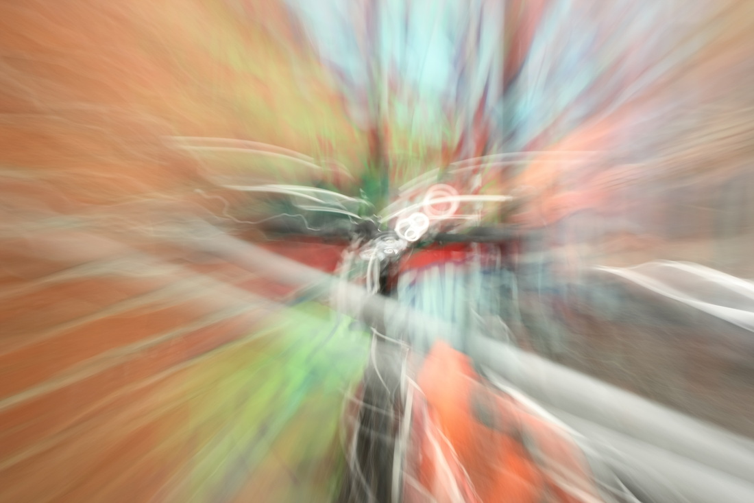
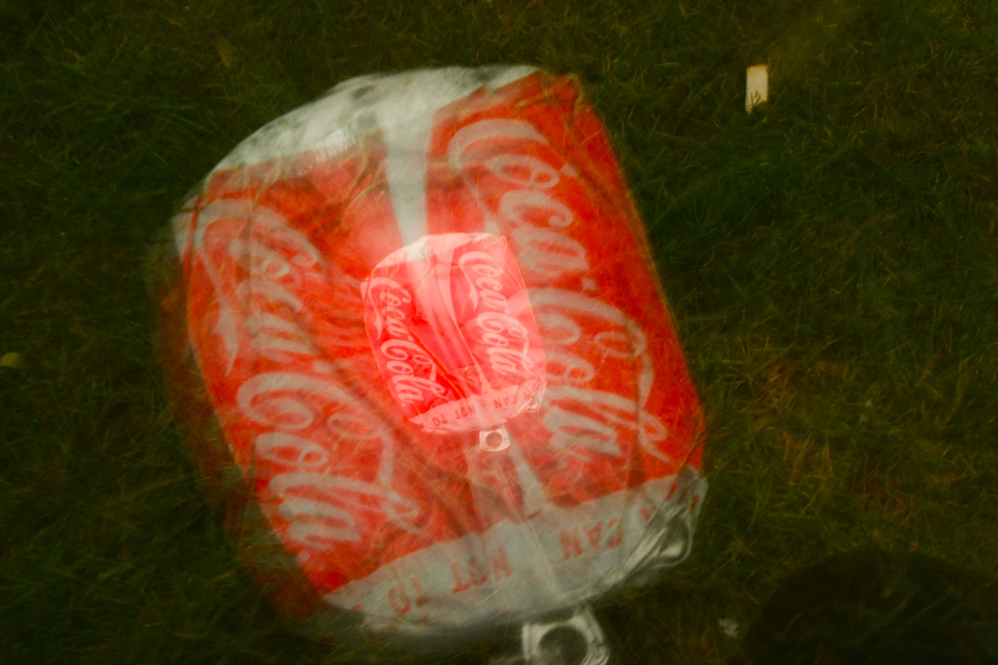
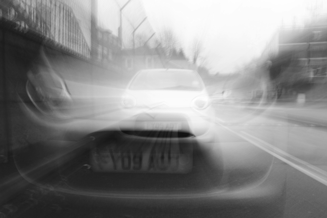
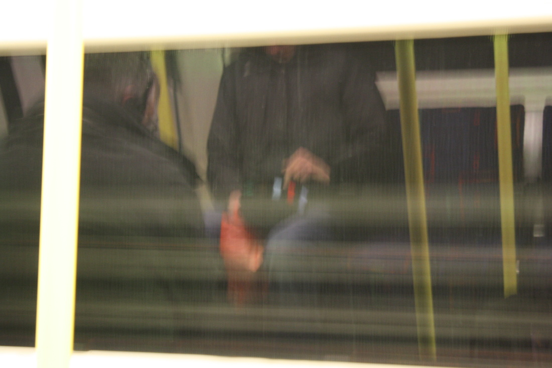
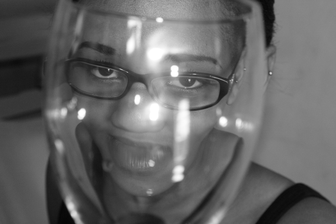
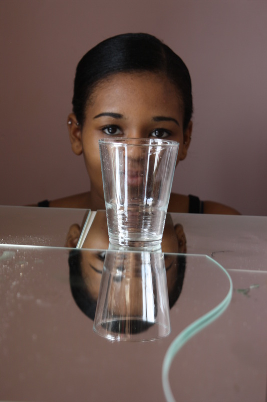
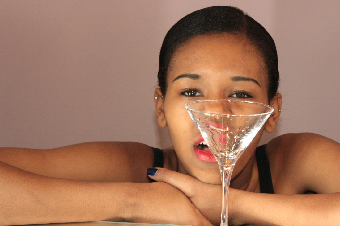
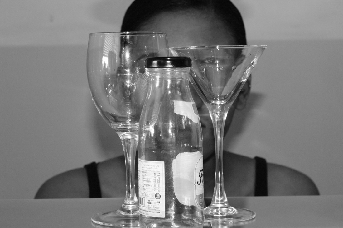
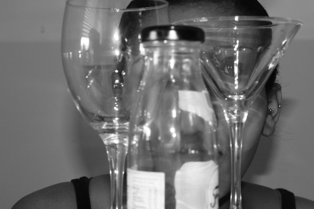
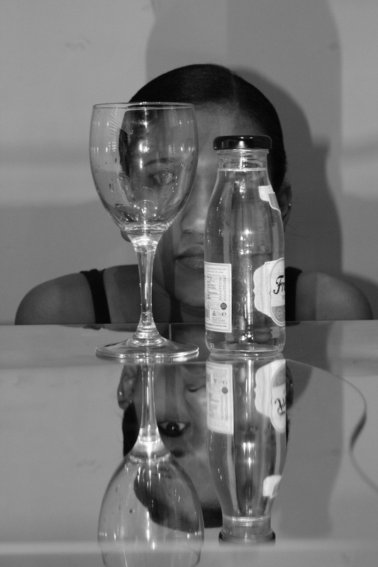
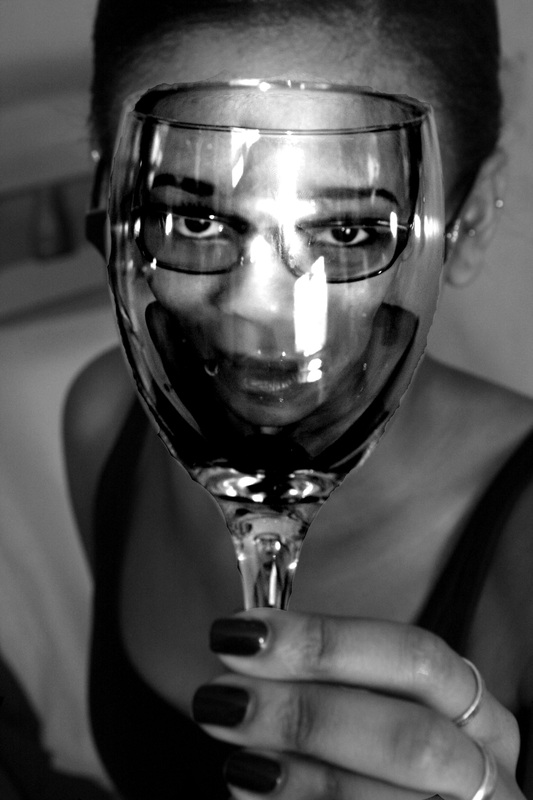
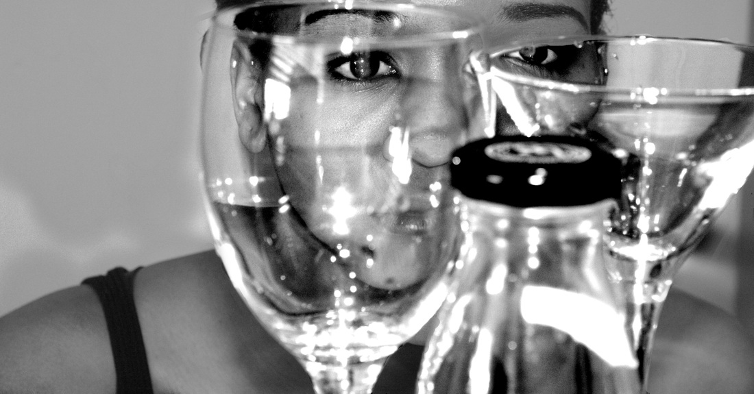
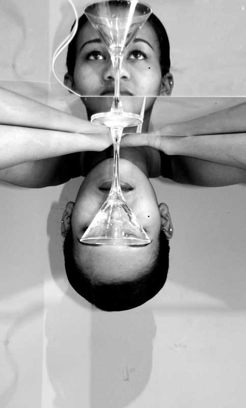
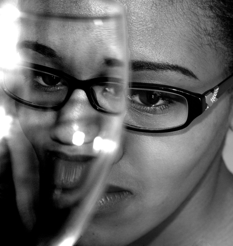
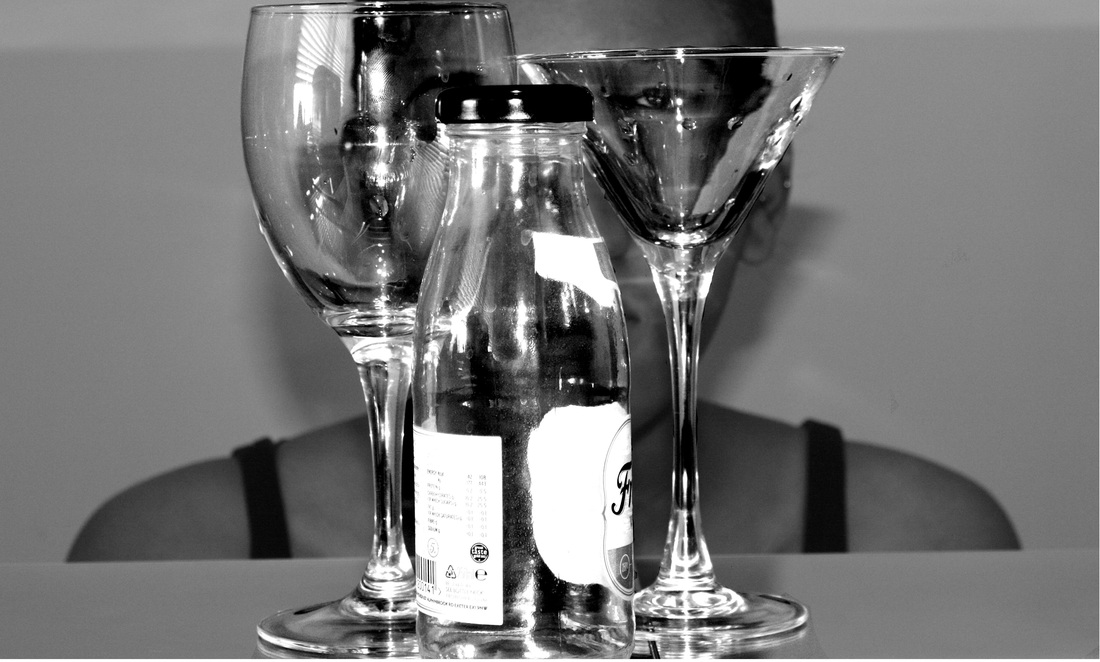
For my next set of images I have chosen to experiment with a 'zoom blur,' this can be achieved through activating the zoom feature on the lens while the shutter is open. I decided to photograph a large object and a smaller object so that I could compare the two, on which had a better effect. Both objects were still because if they were moving the whole image would be too blurred. I changed aperture depending on where my photo's were taken. Some were inside and thus needed a bigger aperture, whilst those outside needed a smaller aperture of around F 22. I also changed the shutter speed, again this depended on where the photograph was being taken: inside or outside; for this I used a shutter speed of ISO 100 or 200 outside, and inside I used a shutter speed of 400-800. It is clear from the photographs I took that the objects outside were much more effective and had a more interesting zoom effect in comparison to the photographs I took inside. I really like the effect that the zoom has had on the coke can as there is a larger can and a smaller can, it looks slightly surreal and a little confusing as it is difficult to decide which can is laying on the floor and which is the one created by the zoom blur effect . However, I do not believe that the images were better or worse dependent on the inside/outside environment but instead due to the range of objects to photograph outside compared to inside where there were fewer available. I think this technique is very effective in relation to the exam theme as it appears surreal and as if the objects moving 'In Between' two worlds.
Original Images

Edited Images
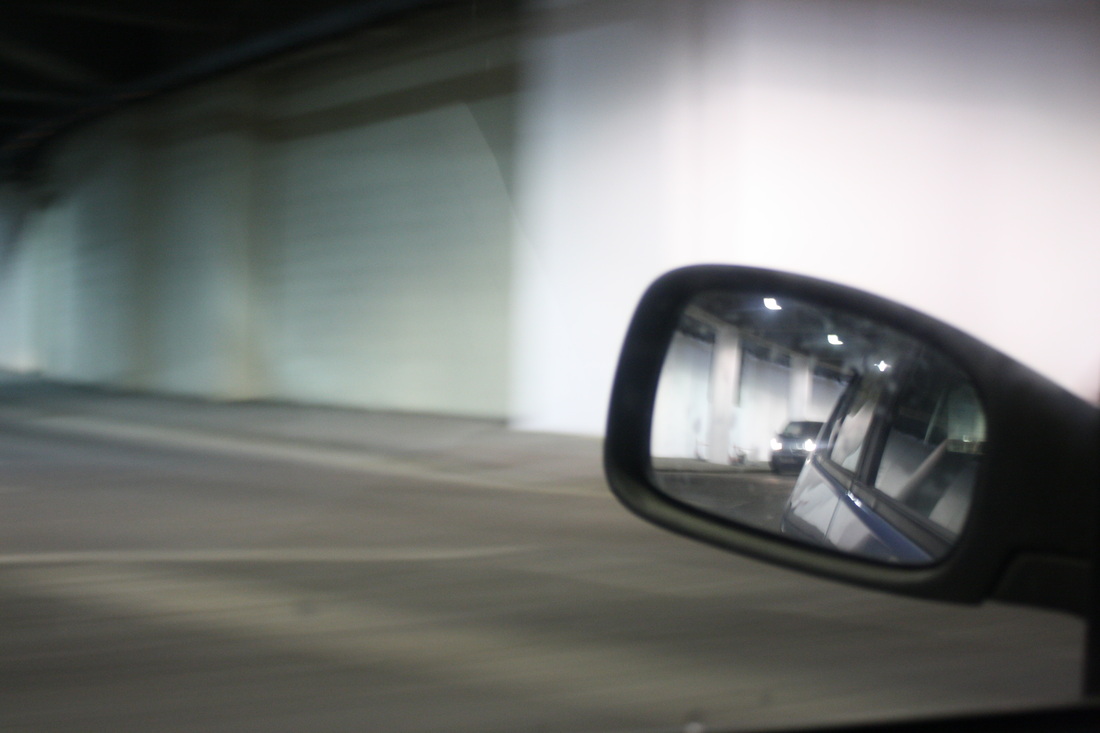
Journey: Lee Friedlander
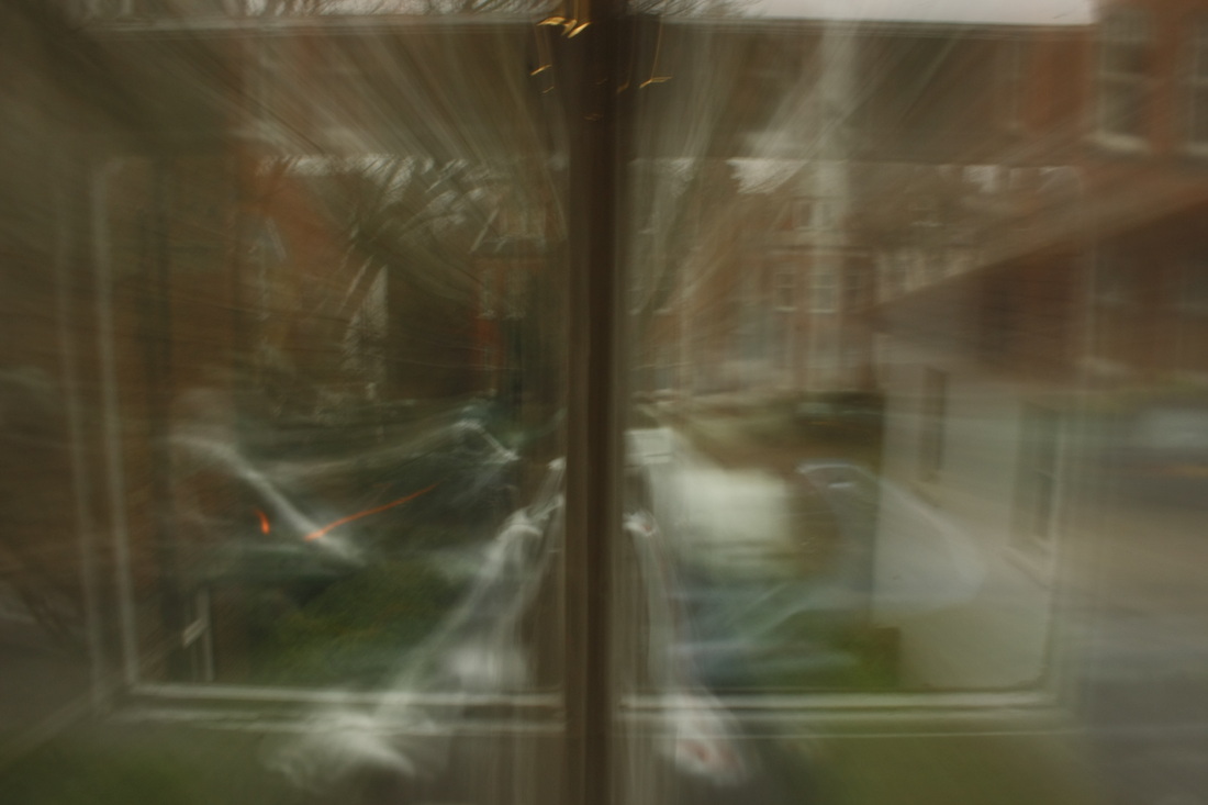
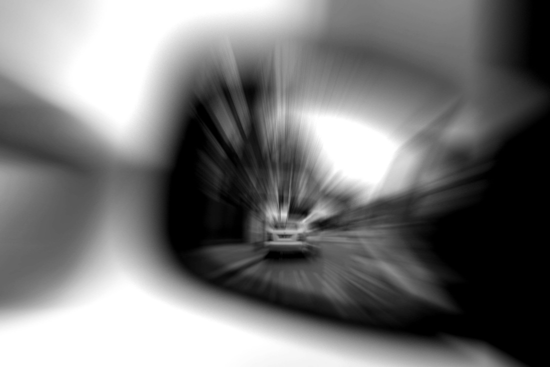
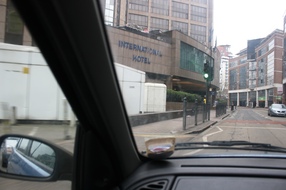
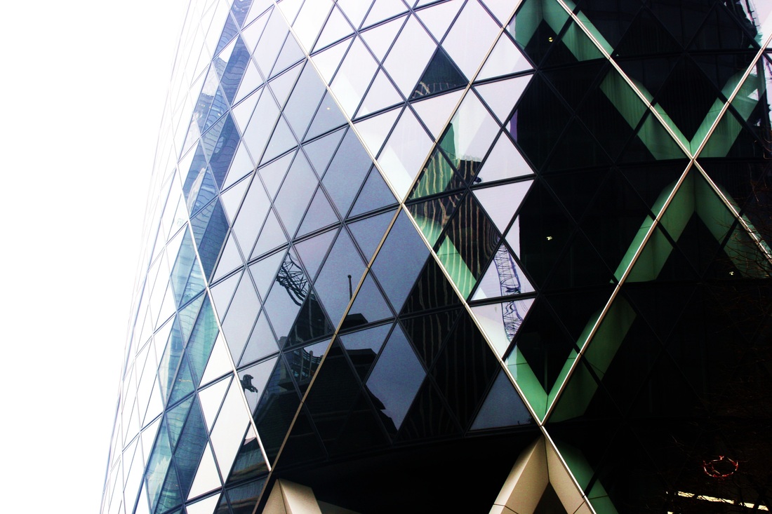
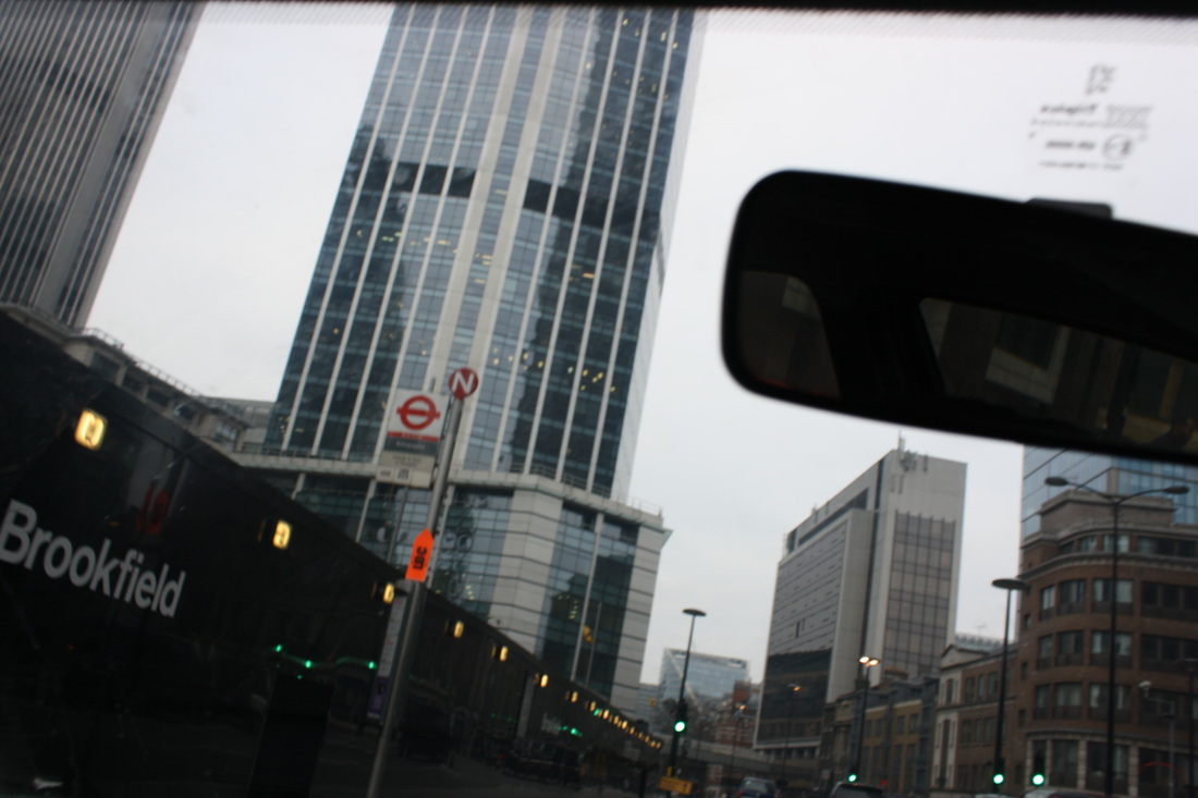
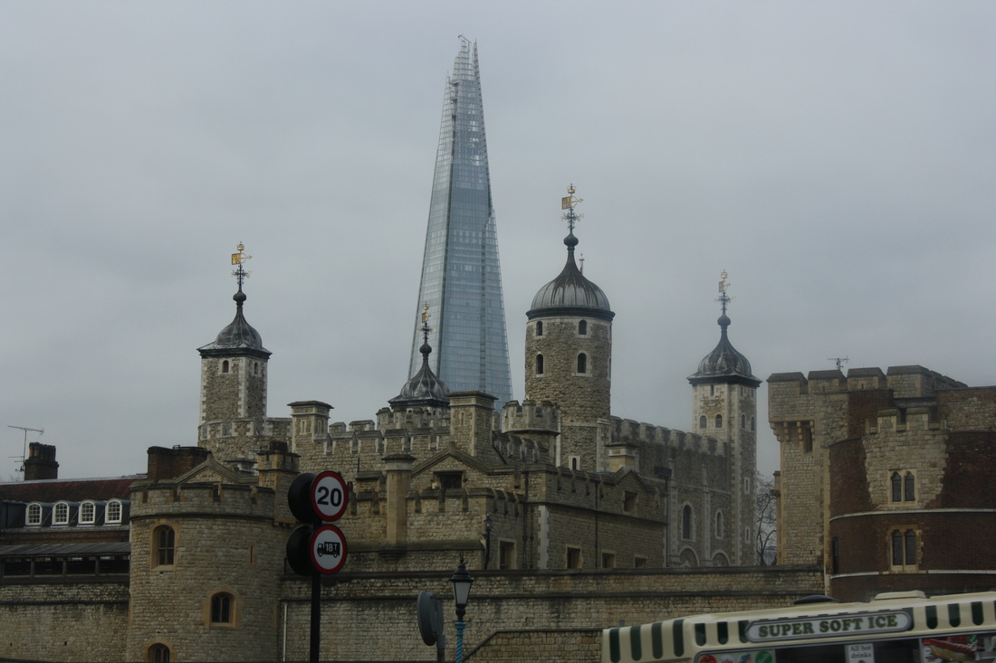
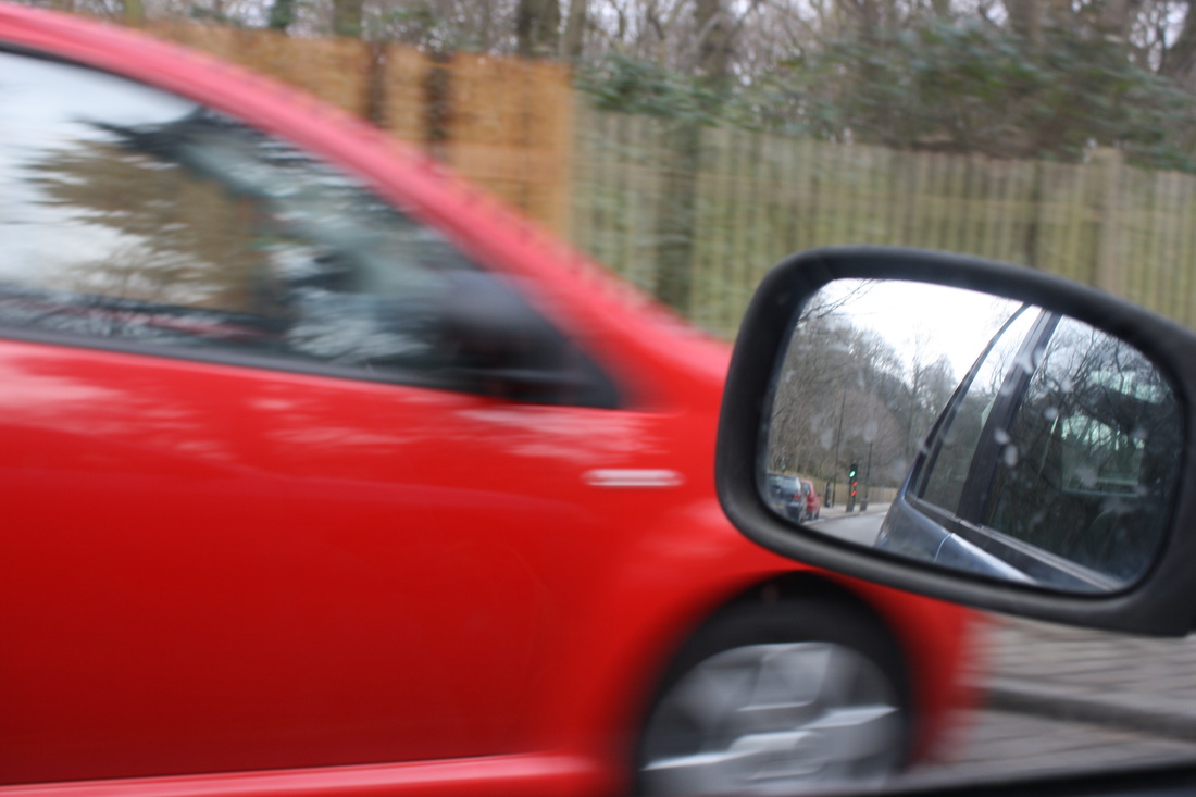
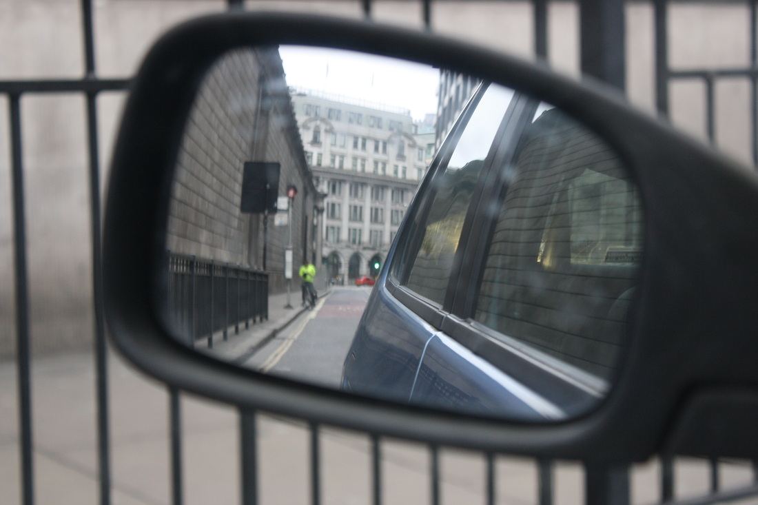
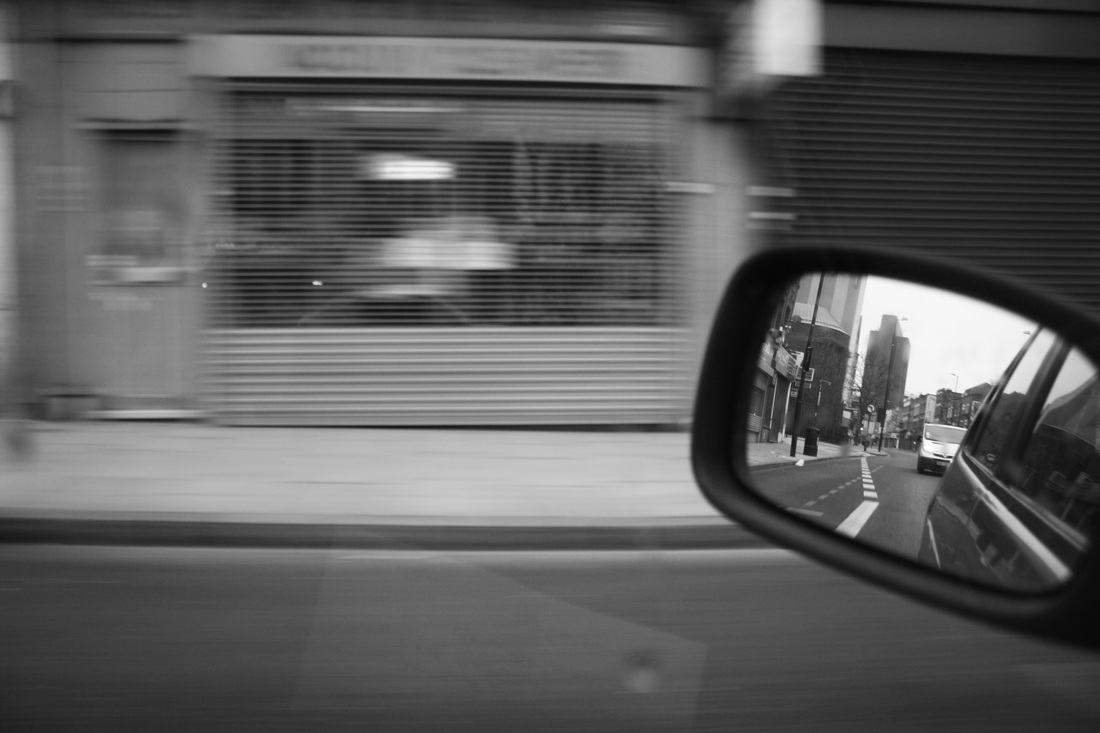
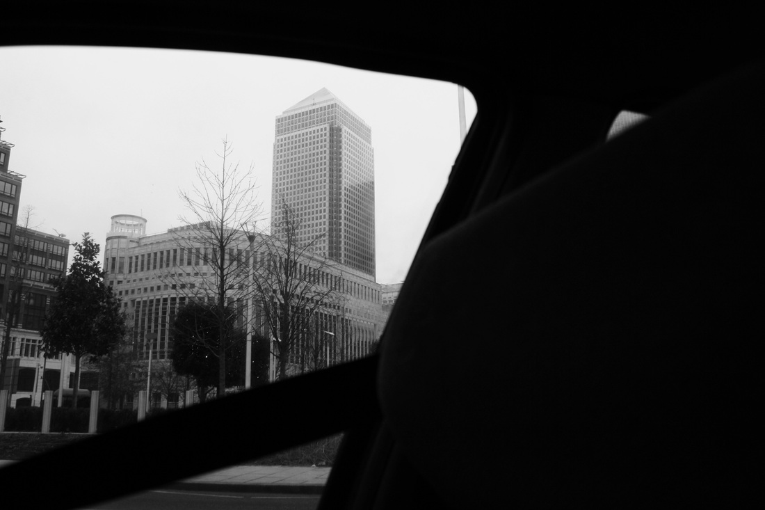
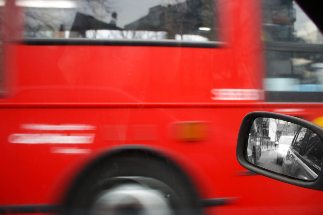
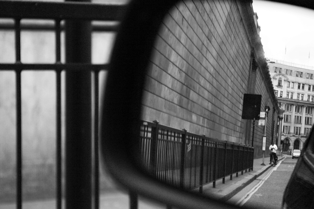
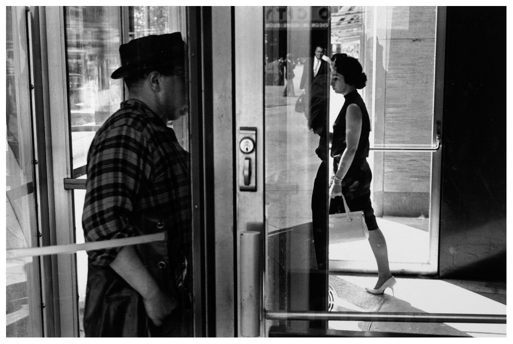
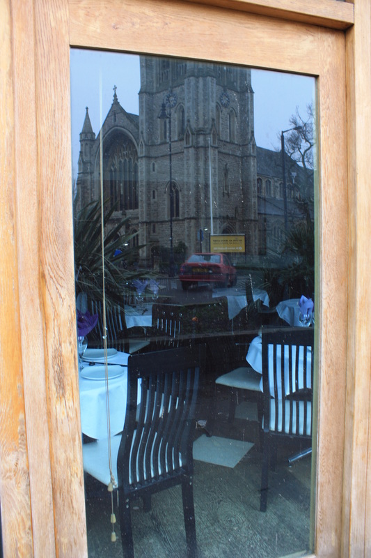
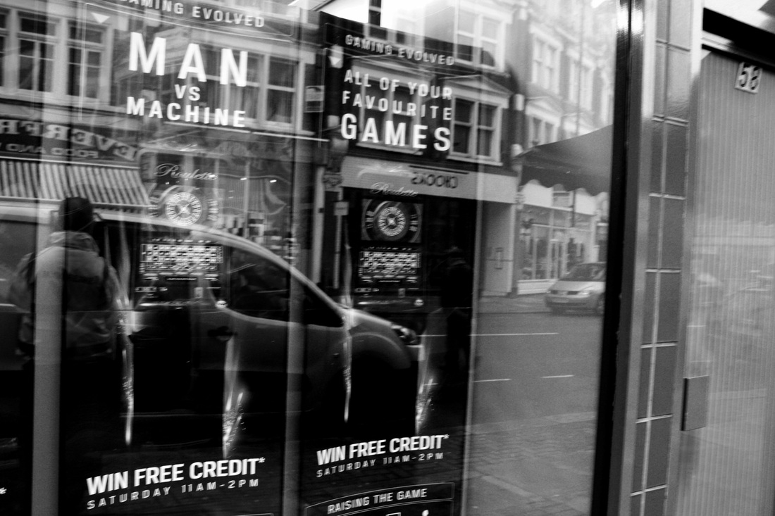
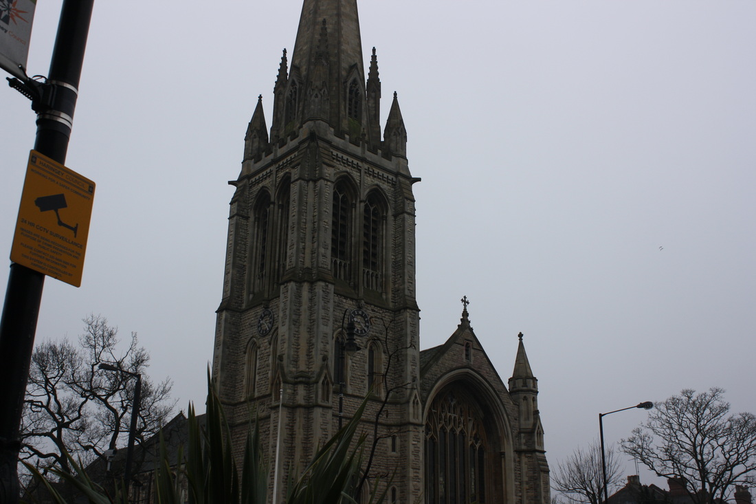
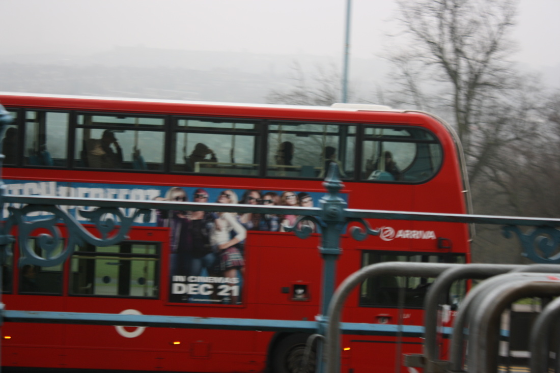
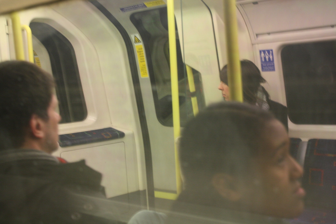
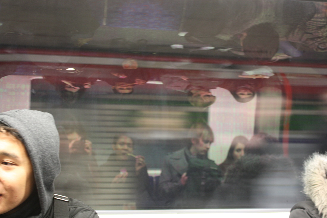
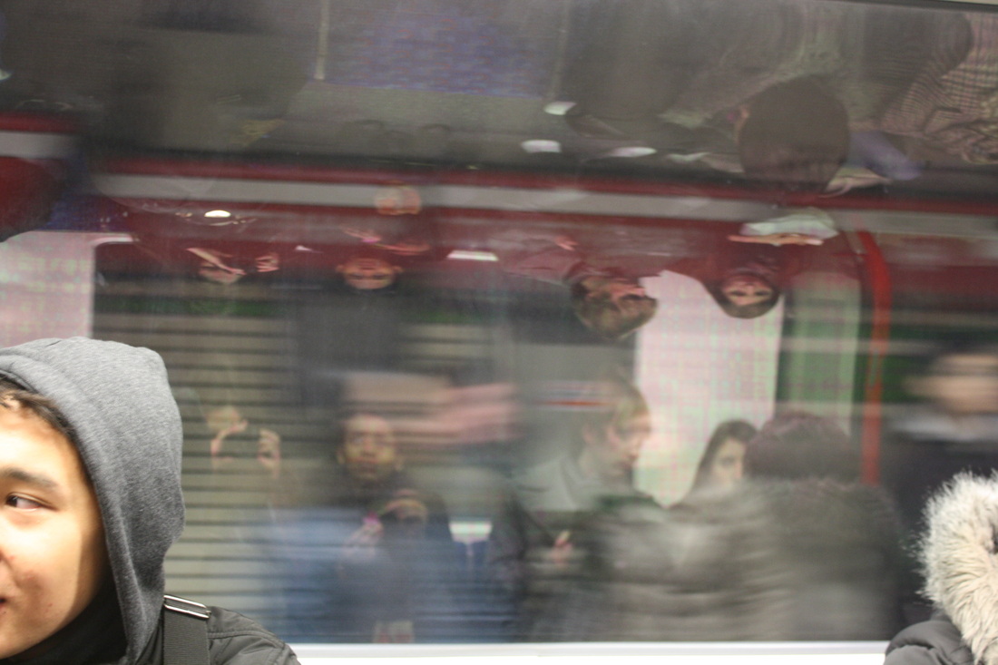
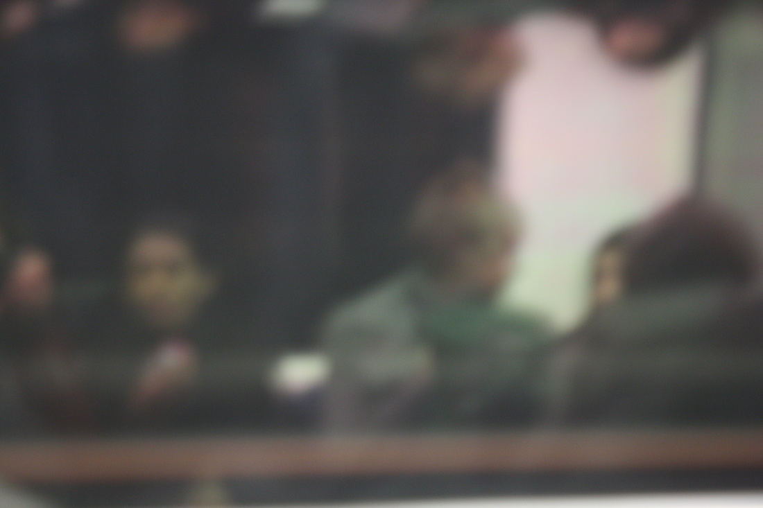
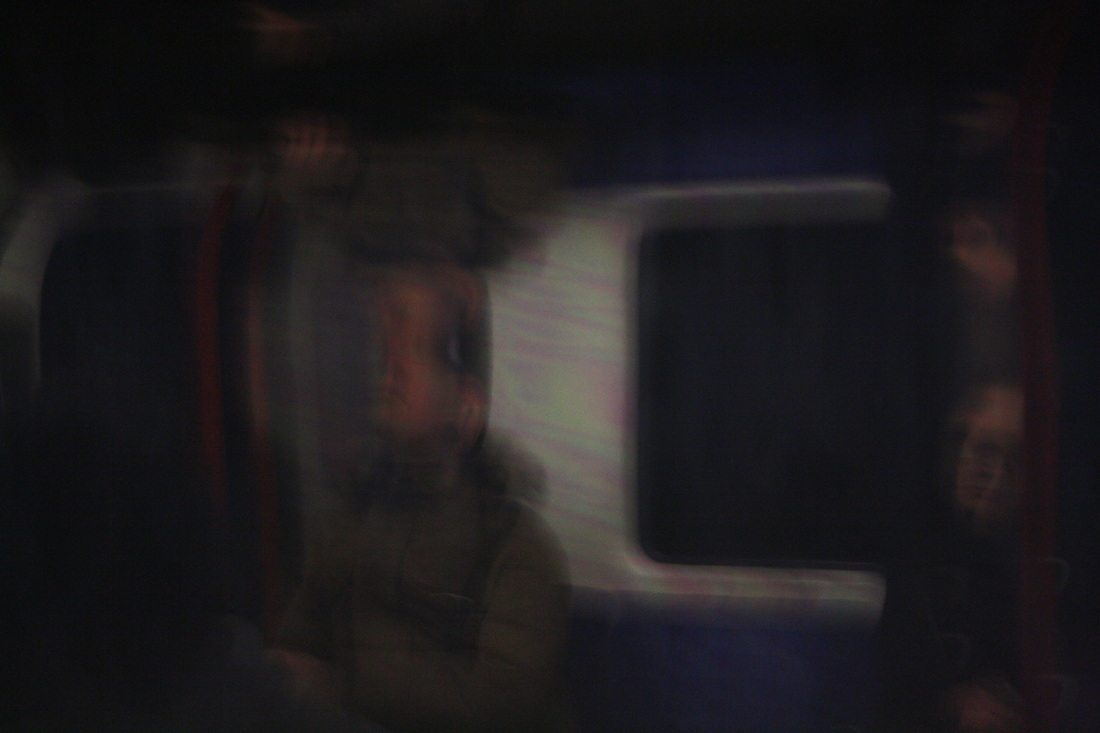
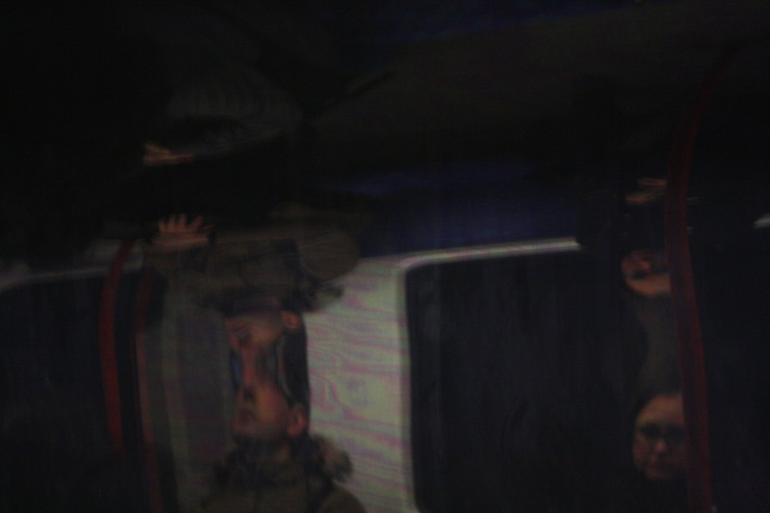
Lee Friedlander is an American photographer and artist. Friedlander worked mainly with cameras in black and white film and often imitated visual language of urban 'social landscape,' with many of the photographs including fragments of shop-front reflections, structures framed by fences, posters and street-signs. He travelled through America by car and took photographic images, however unlike other photographers he took it through the windscreen, his wing mirrors and car windows - his images were technically showing both the inside as well as the outside. As mirrors are often associated with showing 'other worlds' or being 'magic' it seems appropriate to the exam title to use such objects within this digital response as it is showing inside a world and outside also.
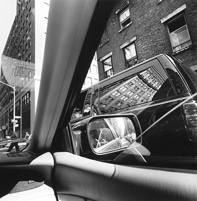
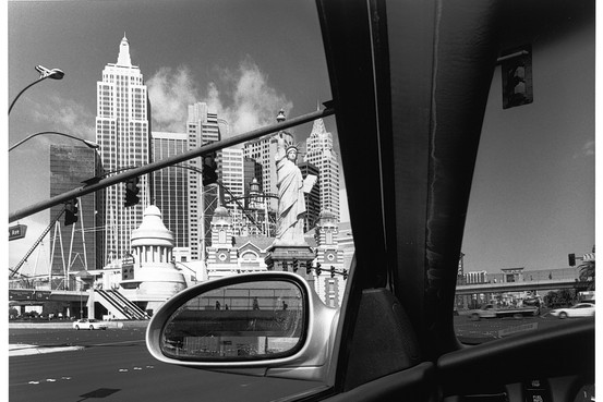
For my digital response to Lee Friedlander I drove in a car around London's famous buildings to capture images inspired by Friedlander, this included: the Gherkin, the Shard as well as Canary Wharf and Tower Bridge. I made sure I captured inside the car as well as outside to illustrate the relation to the exam theme, additionally the 'journey' theme illustrates moving in between places. I edited most of my photographs into black and white as they looked too loud in colour and reduced the attention away from the focus of the photograph which is the mirrors, doors and buildings.
What went well: Overall I believe that this digital response was highly successful, I was intrigued by the use of mirrors reflecting something other than the background behind the mirror, it is a picture within a picture. The use of the car mirrors, car windows and other objects which the car consisted of were still in the picture despite not being the central image within, however I do appreciate that these were actually a large focus despite not appearing so: it was the main contribution to the idea of travelling between places in a car and reflecting inside whilst the rest of the image was focused on the outside.
Even better if: To make this set even better I think I could have stopped the car and centred around one specific area to capture a more focused set of images. However, I am happy that my set is diverse rather than based around one scene which would have resulted in a more narrow set of images.
Original Images


Edited Images
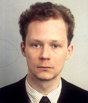
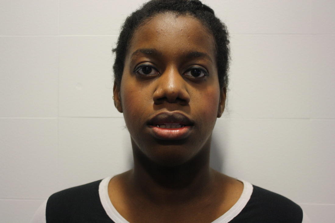
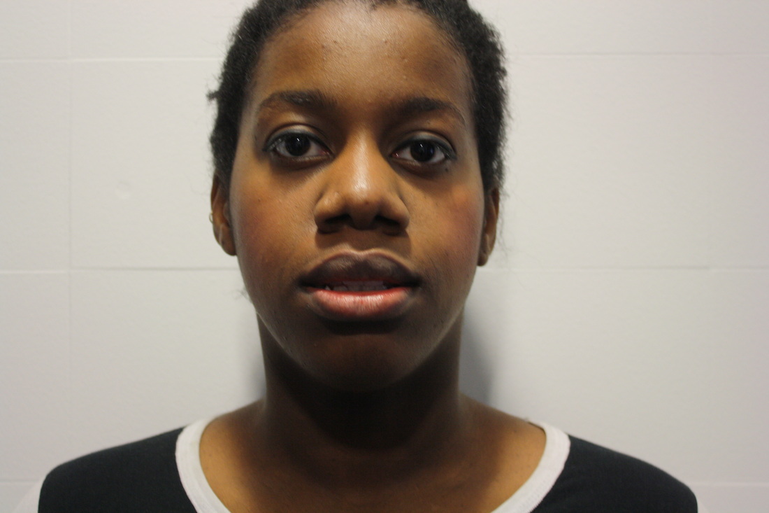
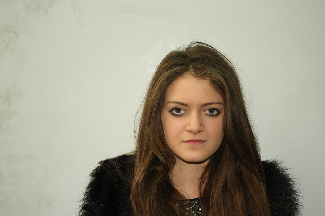
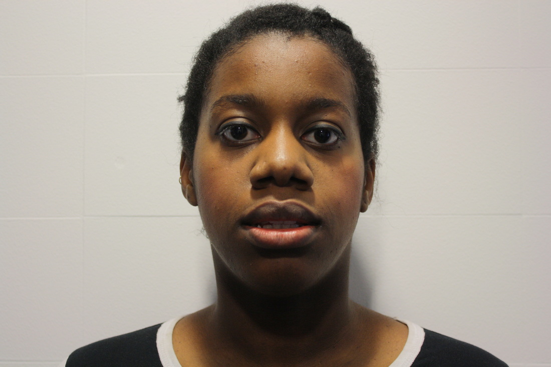
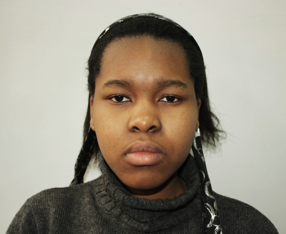
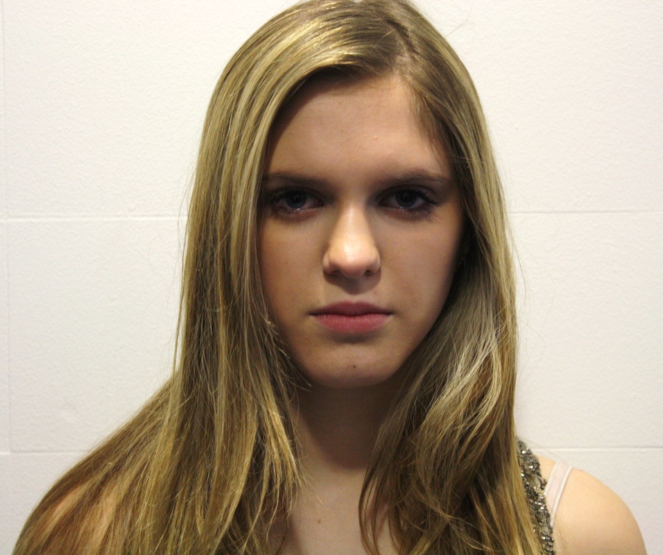
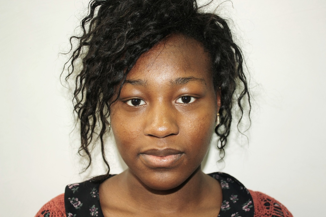
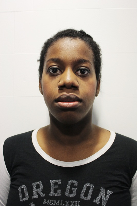
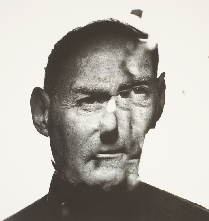
Thomas Ruff: Strand One
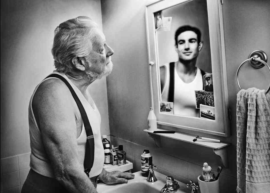
Thomas Ruff is a German photographer who took sixty portraits of different people all in the same style: passport-like images, with the upper edge of the photographs situated just above the hair, even lighting, the subject between 25 and 35 years old, taken with a 9 × 12 cm negative, and because of the use of a flash without any motion blur. His early portraits were in black and white, however later on he switched to colour and often used solid blank backgrounds in each portrait. The resulting Portraits depict the individual persons framed as in a passport photo, typically shown with emotionless expressions, sometimes face-on, sometimes in profile, and in front of a plain background. The photographs are unglamorous and are of ordinary people, devoid of expression. It is suggested that the portraits imply that a photographic image cannot represent a subject's inner life but instead a more socially based mode of representation. The reason I have decided to research Thomas Ruff and use him within this project is because his portraits illustrate that what is on the outside (expression) is not necessarily representing the inside (personality or thoughts.) Thus I wish to explore this relationship of outer and inner expression, as well as display.
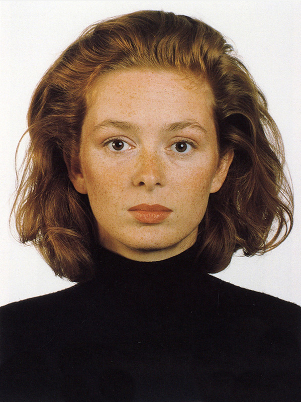
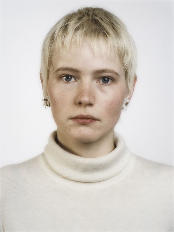
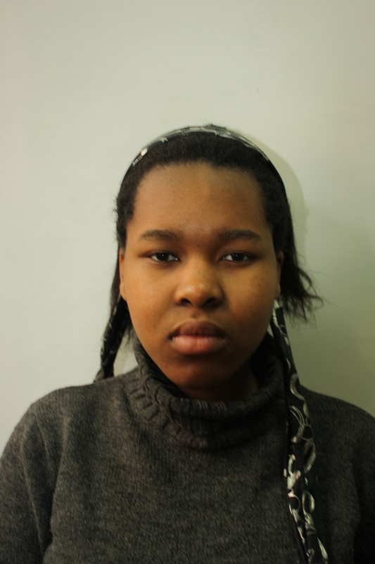
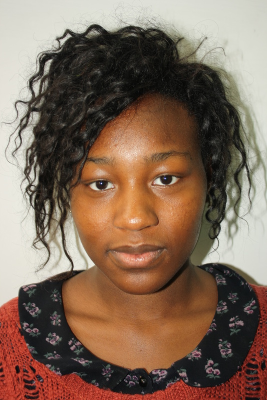
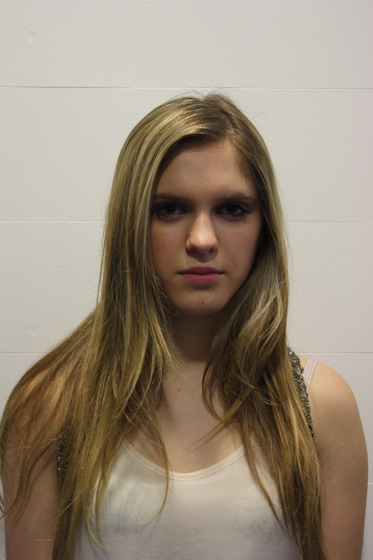
For my digital response to Thomas Ruff I photographed several people looking blank against a white background and then edited the images to create a colourless effect. I selected only four photographs rather than a wide selection as I believe this concentrated set directly illustrate the effect which I was trying to capture of looking mute.
What went well: I feel that the images clearly illustrate Ruff's ideas with several people having the same expression yet they obviously are unlikely to all be feeling the same, hence relating to the exam title that what is on the outside does not necessarily reflect ones inner persona.
Even better if: To improve this set I believe it would have been an idea to get each subject to swear the same colour top in the exact same type of style so each looks very similar to the next. I believe this is a good idea because although they would all look completely the same, they would all be feeling varying contrasting emotions inside naturally. This perhaps could be an idea for future development.
Original Images

Edited Images
Lee Friedlander: Strand Two
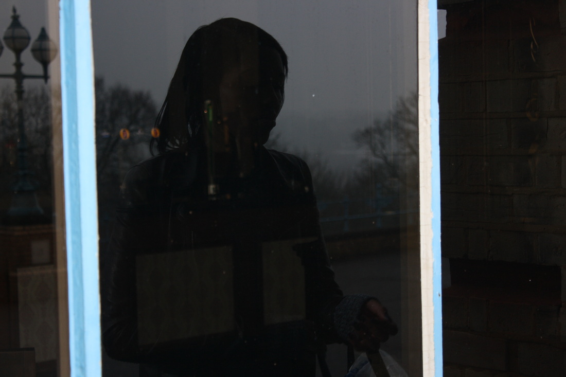
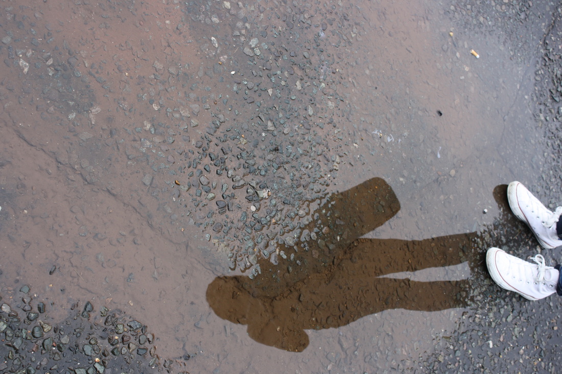
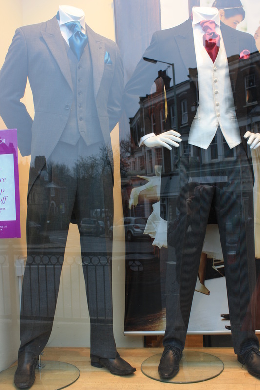
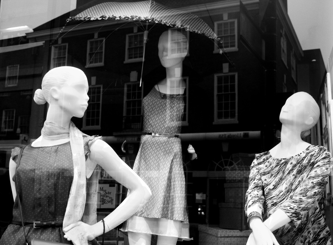
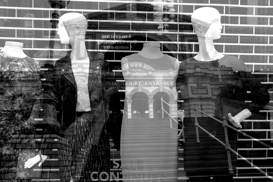
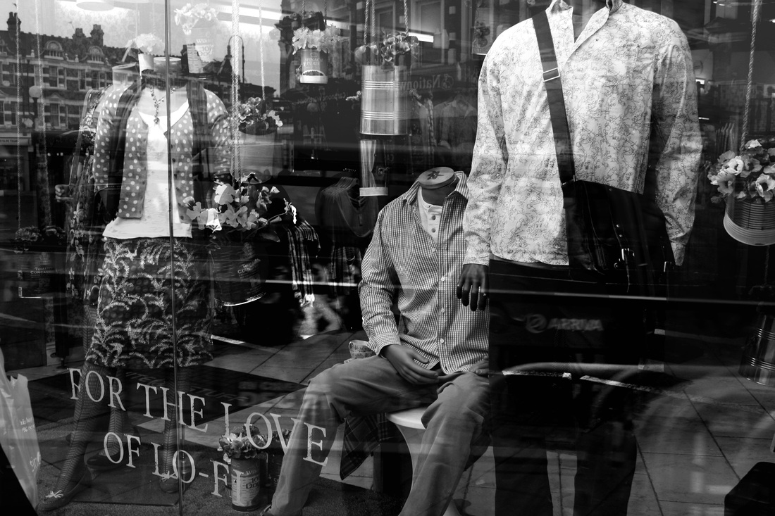
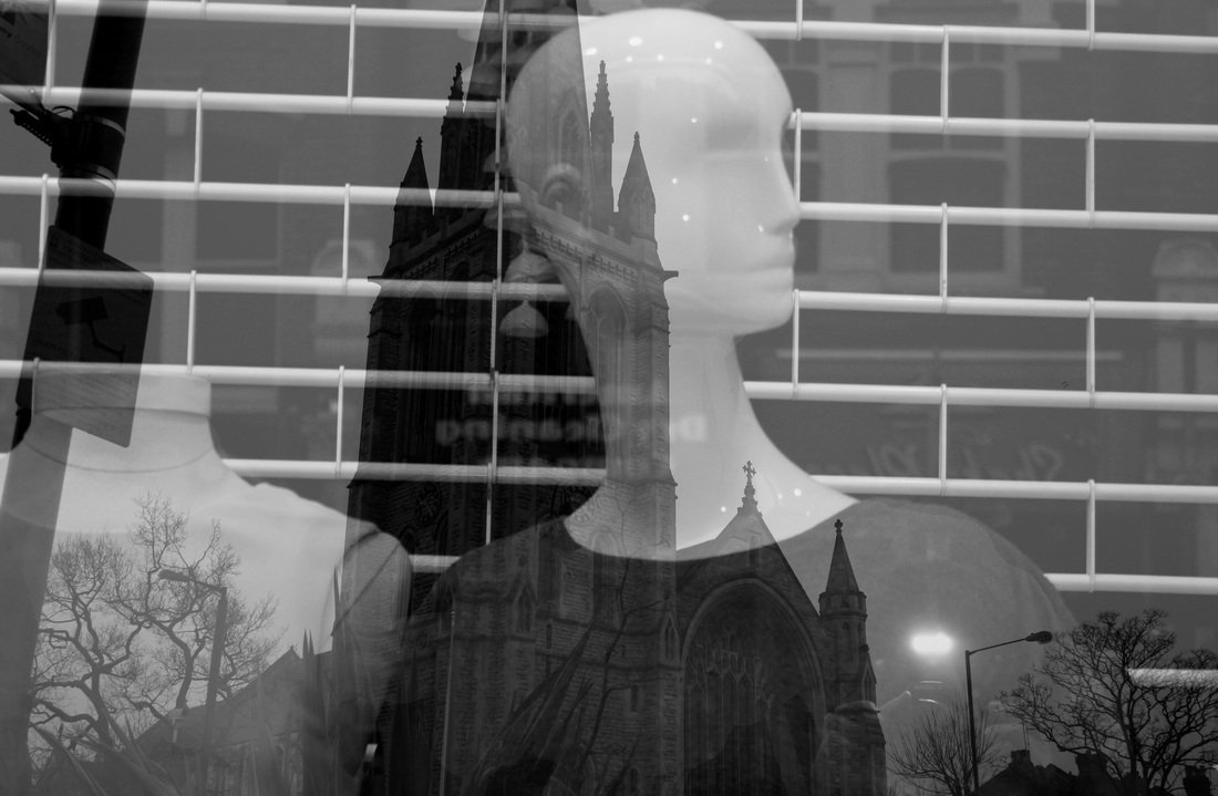
Lee Friedlander completed a collection of images on 'reflections' of shop front displays, revolving doors and simply the shadow of himself. Shop front display windows have been a feature of street photography since it emerged early as a genre in the last century. This urban fabric is irresistible to any eye beguiled in indoor and outdoor space. Thus for Friedlander, in the 103 photographs in Mannequin, published in May by San Francisco’s Fraenkel Gallery in relation with a similar exhibition, the veteran photographer took hold of this familiar idea and made it entirely and unmistakably his own. The images are black and white, shot in a variety of locations, including: New York City, L.A, San Francisco, New Orleans and other American cities. In each, a mannequin is featured in a glass shop window which reflects buildings, people and other scenery. The reflecting buildings and street bins invade the dummies glamorous domains so that the other objects are superimposed on evening wear, furs and lingerie.

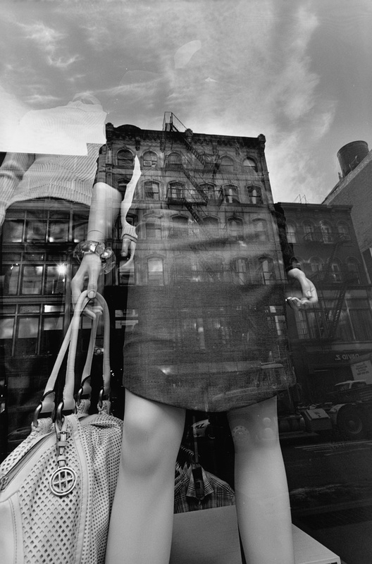
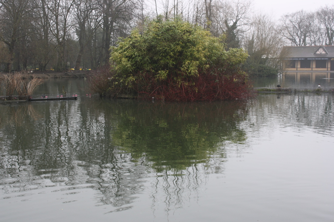
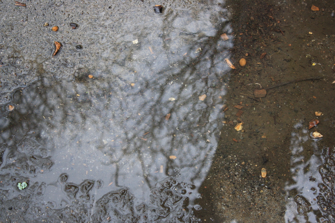
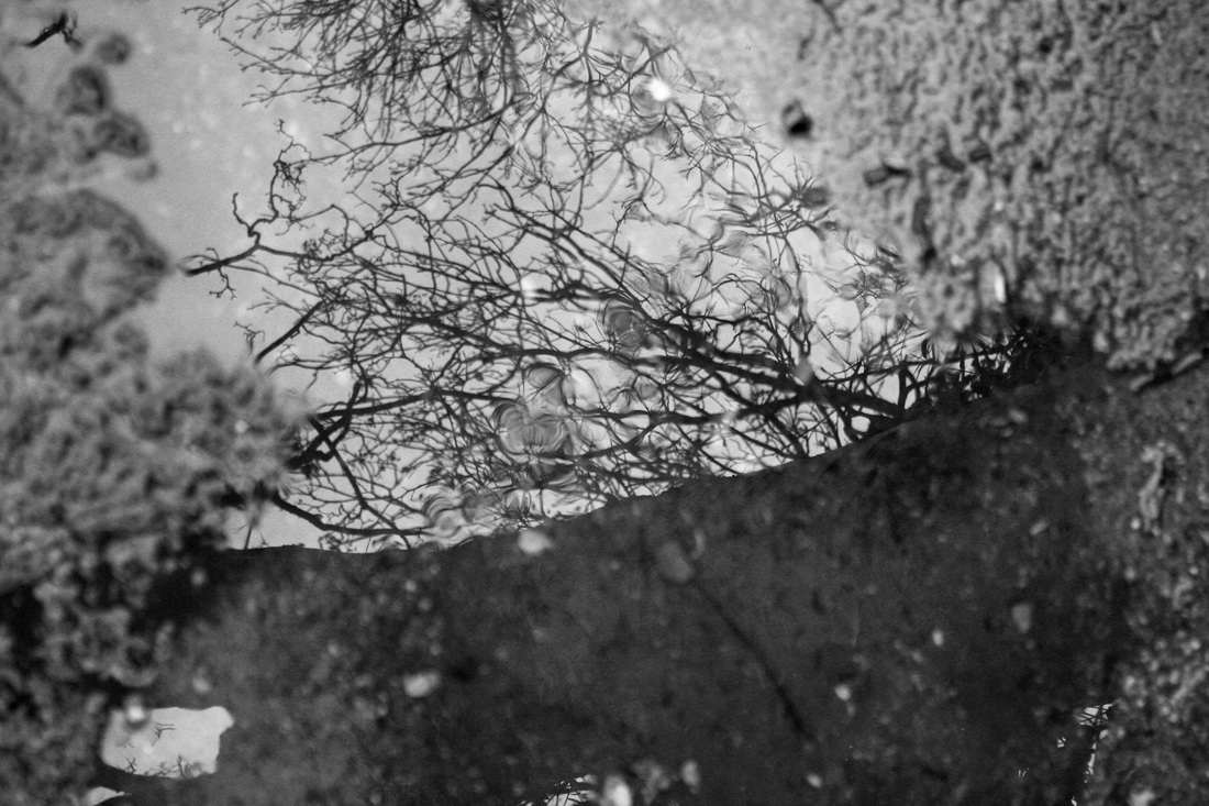
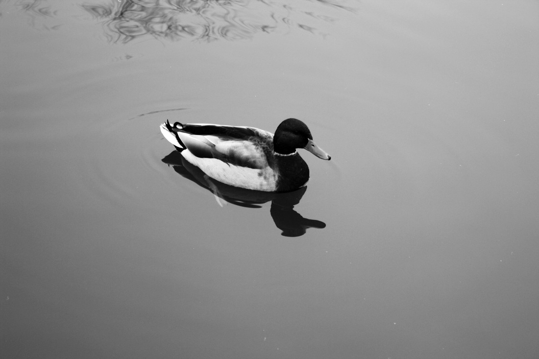
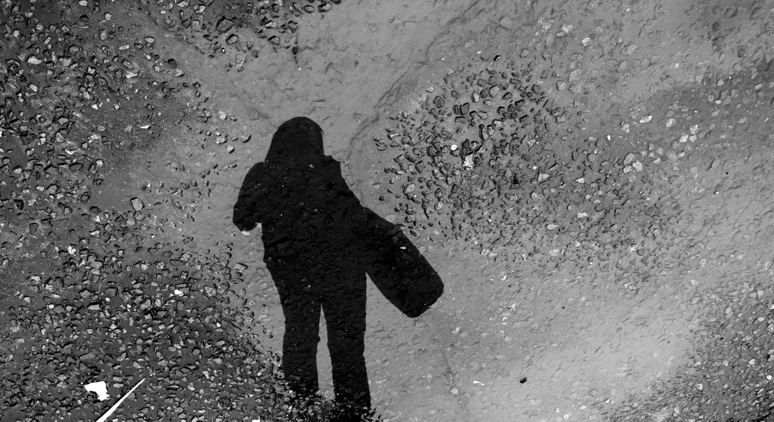
For my digital response to Lee Friedlander I took shots of various reflecting subjects and objects, this included live animals, greenery, shop windows and puddles. After having taken the photographs I edited them in Photoshop to enhance the reflections against the objects. I decided to create a very diverse response to Lee Friedlander's reflections because I am very keen on pursuing this idea into further development and thus wanted to discover which area of reflections I was interested in: whether it be natural or superficial, photoshop-created or naturally created.
What went well: I am very happy with my outcome to Lee Friedlander, I believe that the images are interesting as they capture very strong reflections in the windows with the manikins. Also the reflections of people in some of the images play on the idea of another world, I believe it is interesting what is left inside the frame and what I decided to reflect. For example, in the natural reflections I chose to photograph a puddle with my model's reflection inside it, thus after cutting out her shoes the image looked slightly obscure as I had decided to leave the actual subject outside of the photograph and just include her reflection.
Even better if: To improve this set I could have gone somewhere more central to take my images so that the manikins varied in size and display to a further extent. Also somewhere where the reflections may be slightly more interesting as opposed to just buildings and cars. However, despite this I believe the images are very effective in conveying my ideas inspired by Friedlander.
Original Images

Edited Images
Natural Reflections: Development

Development
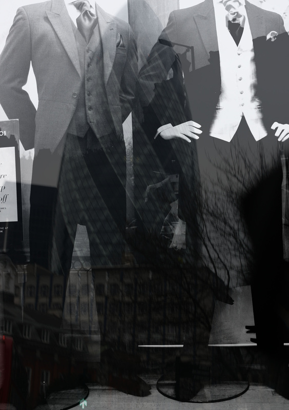
To develop this idea into contrasting it with other techniques I decided to take photographs of mannequins and scenery separately and then superimposed them in Photoshop. I wanted to discover which technique worked best and how they appear different despite aiming for the same outcome. I focused on picking a suitable image to superimpose which would work well with the mannequin it was being faded onto: for example, there is a photograph of two mannequins in suits with one having his hand on his hip and the other with his hand behind his back, they look very abrupt and professional, thus I chose to superimpose a photograph I had taken of the Gherkin as this has connotations of professionalism, official titles and smart dress.
What went well: I found editing these images superficially very useful as I was able to match the mannequin to any reflection which I found suited. This allowed the mannequin image and the reflection to flow very well into one and other due to the relationship with what the images show - however this is only true for a few.
Even better if: Although the photographs could be seen as flowing to an extent I believe that being artificial the natural ones in my previous set were better as the image was clearly a natural reflection whereas here some of the shades clash to some extent, and making it obvious that it is a superimposed reflection.
Original Images


Edited Images
Gillian Wearing: Strand Three
Gillian Wearing is a British based photographer and artist who first started her work in the early 90's when she asked anonymous strangers to hold up a piece of paper with a message on it, they were named, 'confessional pieces.' This type of work continued into video films, which can be seen below, Wearing uses masks to disguise the speaker as each 'confesses' to an act which perhaps is frowned upon, or appears as 'taboo' to wider society, an example of this is being an alcoholic: one man confesses to this. Wearing once said, 'we all have a certain badness about us, but the most insane thing we could do is try to be sane,' this illustrates that on the outside people may appear normal and try to fit in, yet in the inside are a completely different individual. Thus I am very interested in looking at this type of approach to photography in masking individuals to allow them to 'confess' about an inner anecdote. I also wish to try filming techniques and this approach shall allow me to explore a different version of photography. Wearing also did a video of two sons and a mother talking, however she had switched the voices so that you could hear the mothers voice when the sons were talking and vice versa. I also am going to attempt this idea as I believe it strongly relates to the exam theme in a very interesting way. This is because despite looking a very specific way on the outside, the inner personality of a person could be a completely contrasting opposite: I shall try this with two different extreme voices and appearances.
For my response to Gillian Wearing I decided to film two opposite people and swap their voices to illustrate on the outside is not always what reflects on the inside. Thus, they contrasted in dress sense, gender and age; this created a very unusual effect when playing the video, similar to Wearing's. To edit the video I firstly filmed each subject separately and recorded each saying the others lines. Then I edited the clips on iMovie so that I could mute each audio and put the other audio on top of the clip. Finally, I selected specific clips out of each long clip to use, so that the response was more detailed and concise, as opposed to a longer video.
What went well: I believe my video response to Gillian Wearing is very effective in reference to the exam title. It draws on both concepts of outside and inside to create a contrasting video. I believe the contrast of the two subjects works very well as it exaggerates the concept of what is on the inside is not necessarily what is seen on the outside.
Even better if: To improve this video I believe the recordings need to be completely in sync with the video. Although most parts of it are, there are a few seconds where the sound is out of time. However, I am still very pleased with the outcome despite the challenge of getting the video and audio in sync.
Response:
Lee Friedlander: Development
After having experimented with three completely separate ideas within the three strands above, I have decided to pursue the idea inspired by Lee Friedlander of reflections. I am really interested in the effects which Friedlander creates in his photographs, from reflections in glass to indirectly photographing himself through shadows and reflections. I find this idea very inspiring due to its varying perspectives, it hugely plays on the idea of inside, outside and in between through the different ways in which he captures images of people.
What went well: I think that this response went well in the sense that it illustrates in between two worlds, it shows subjects in the photographs as well as reflections. I really like how that in some of the photographs the subjects reflections are mirrored again upside down, it creates an intriguing and interesting effect.
Even better if: To improve my response I could have taken photographs from different angles. Although I did this to some extent I think I could have had a more varied set of images if I had stood at the head of an isle and had taken photographs of people on both sides with their reflections in the windows. I am not happy with this set as a whole as it doesn't seem very defined but instead quite scatty. I prefer images when they are focused and created with a precise aim; this appears slightly more of a spontaneous collection.
What's next: Next I had decided to develop my previous idea of natural reflections as I believe the patterns in the reflections could work very well. I have decided to try natural reflection due to it's ability to look at though the inside and outside world are connected through the reflection. For example, reflections in water are usually joined to the real life landscape within the photograph: this idea is explained further in my next set of observations.
Original Images

Edited Images
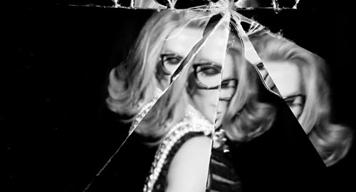
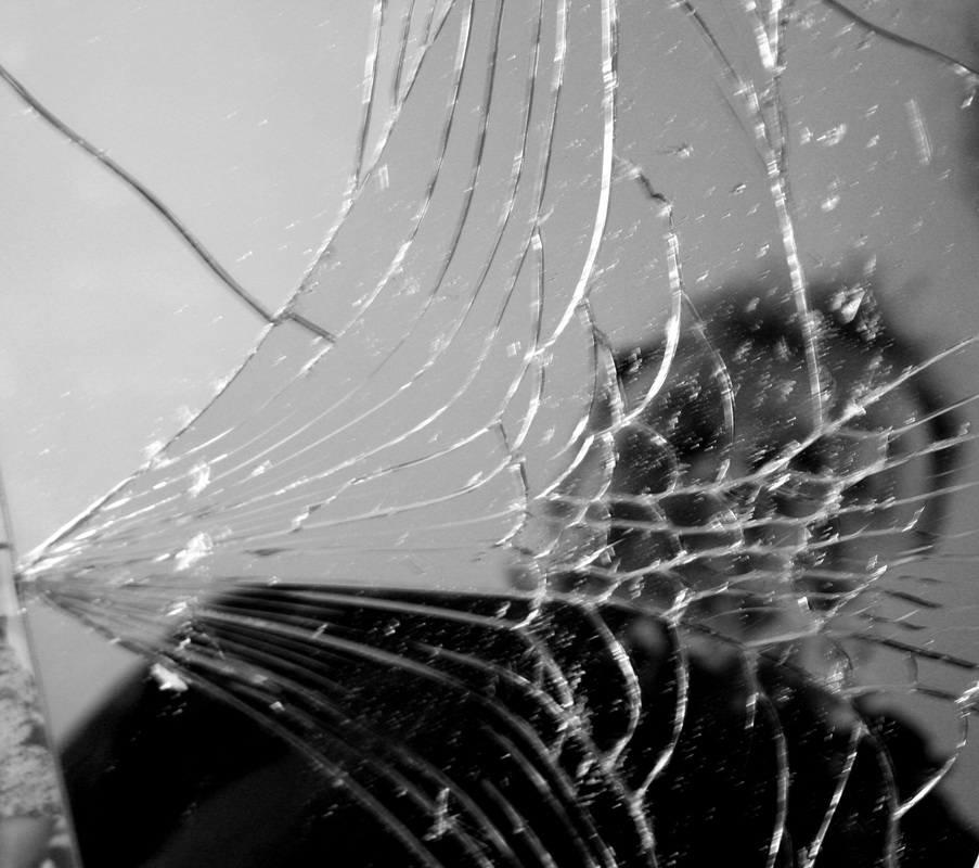
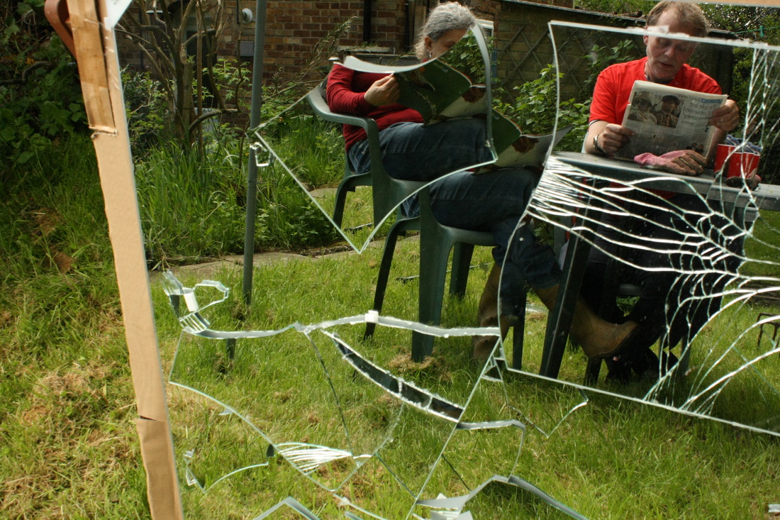
Cracked Mirror: Research
Through researching the work of varying different photographers I was inspired by the idea of a cracked mirror reflection. I have been interested in the idea of distortion from my third strand which was a video response to the work of Gillian Wearing. Distortion can be defined from Oxford Dictionary as, "giving a misleading account or impression." Thus with my Gillian Wearing response although there was no physical distortion, the distortion came from the individual's appearance misleading the viewer, because their voices proved to be a stark contrast to the typical expectations of the observer.
As a result of this interest, I decided to research other types of distortion, this included smashed mirror fragmentation which can be viewed as a physical distortion. There was not a single photographer that influenced my ideas but instead several as I believe I have taken something from each, this includes the work of: Ivring Penn and Eva Pechmarie. Each of these photographers are different, whilst Pechmarie takes a slightly more beautiful and delicate approach, by contrast Penn prefers a realistic and blank approach where he has decided not to produce a glamorous distortion but instead his photograph illustrates the blunt truth with neutral shadings in his self-portrait.
It has become apparent to me through gradual research that not only am I interested in the idea of distorted reflections but also the idea of a reflection duplicating the same person or part of an individual: depending on preference. In Eva Pechmarie's photograph this is most apparent as the models head is duplicated at least a dozen times; this creates a further distortion as the observer is mislead on which parts are reality and which are distorted. Thus, with reference to the exam theme 'Inside, Outside and In Between,' I shall be focusing on what I chose to distort inside the frame and what to leave outside.
Reflections: Development
Original Images

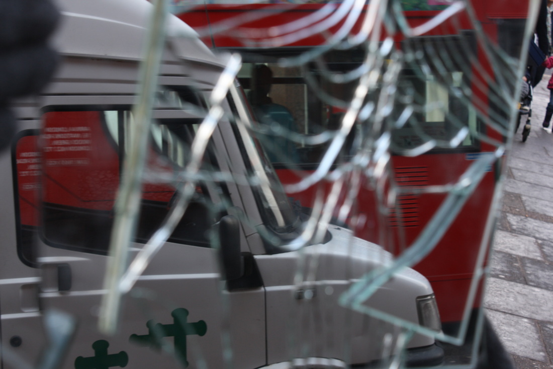
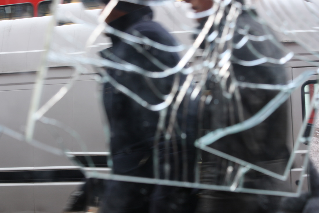
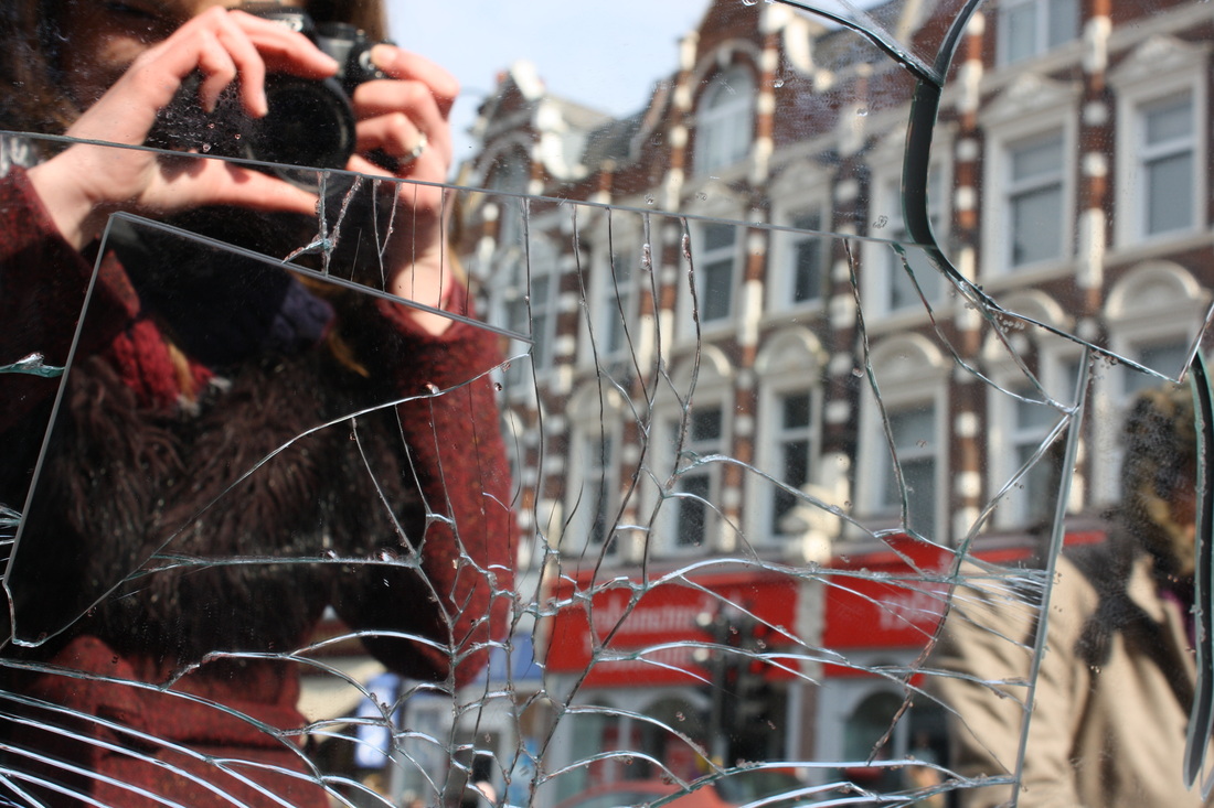
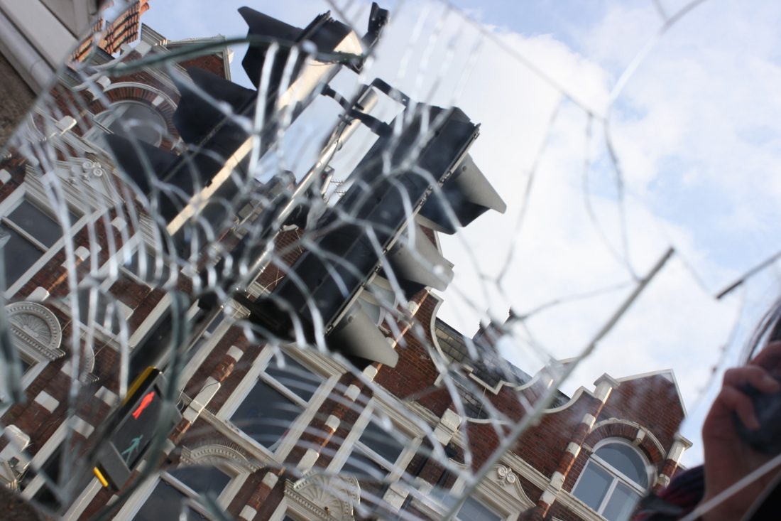
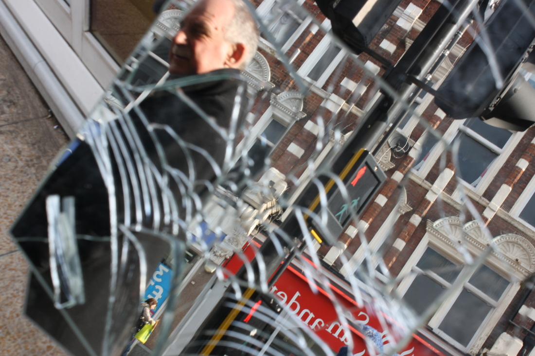
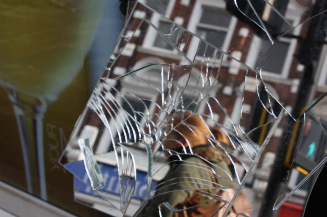
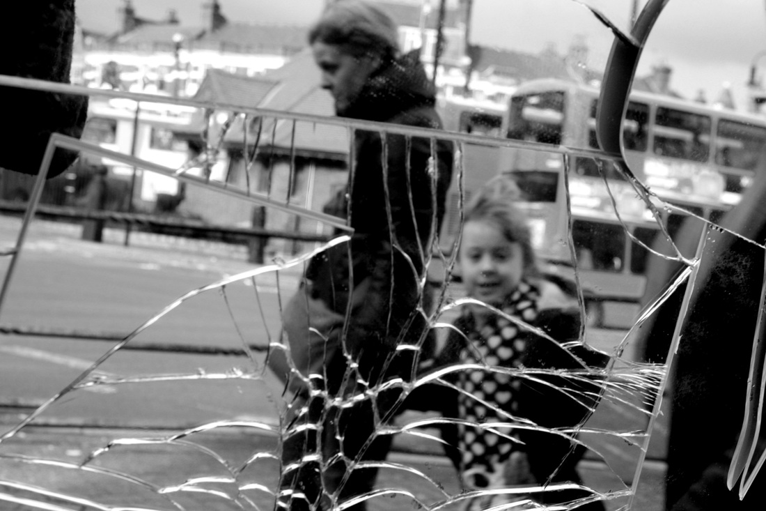
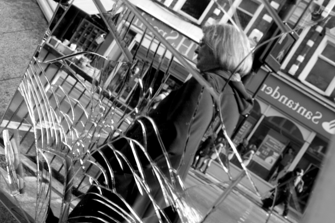
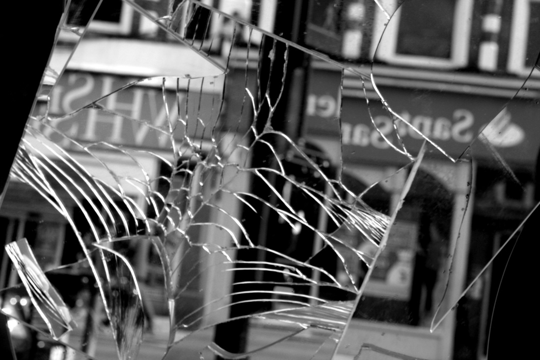
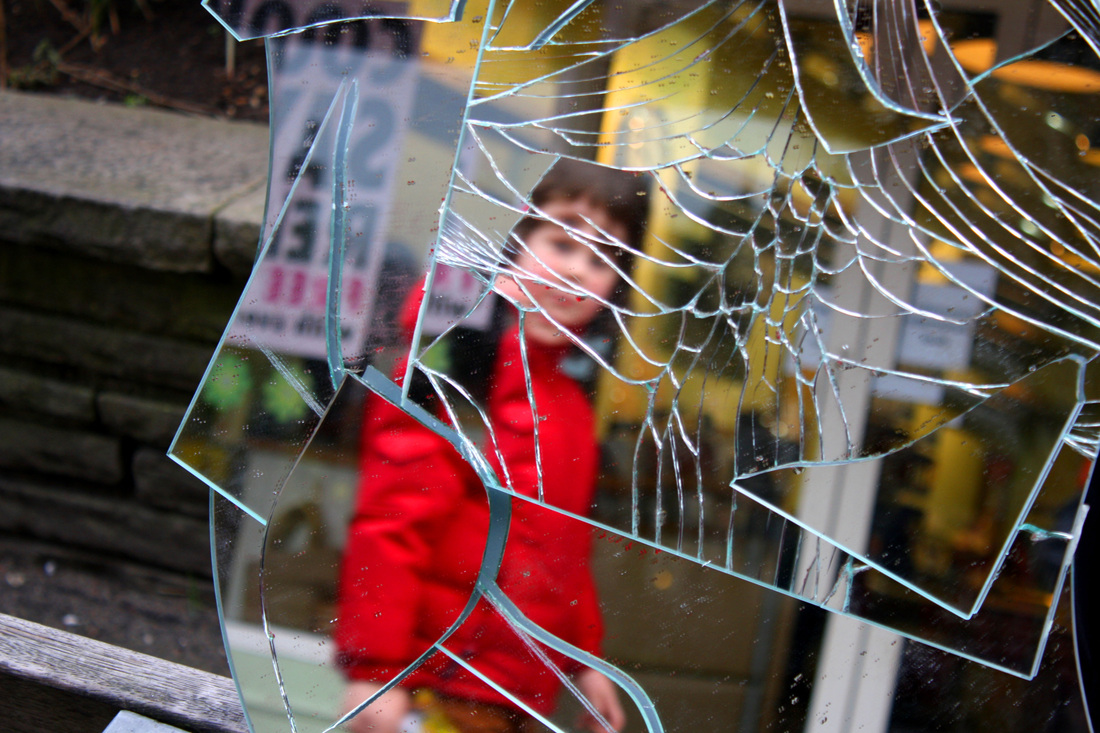
To further my development of reflections I have decided to look at the different distorted reflections in a smashed mirror. I have decided to complete a digital response to this because I am interested in the way things can appear fragmented and on how one can play on the idea of what you decide to keep inside the frame and what is decided to leave outside. Also, not only does the mirror reflect objects in front of it, it also can duplicate an object in the reflection through the effect of the fragmentation: I believe this shall be an interesting effect to experiment with. I also want to look at how everybody has a distorted inner self and thus through capturing the general public this shall be illustrated most effectively as there will be a wide variety of different individuals; thus illustrating this over all point.
What went well: I believe that this digital response to reflections was very successful. As the general aim for this response was to reflect the idea that every individual has an inner turmoil. It also has become apparent to me that brighter colours work better than black and white; thus when pursuing this idea further I shall consider using highly saturated colouring.
Even better if: To improve this set of observations I could have focused on a single person and just reflected their facial features separately into a shard of glass - I shall maybe try this in a later development. However I believe using varying people on the high street created a much more interesting digital response as opposed to staging the photographs.
What's next: Next, I shall look at mirrors within a mirror, and changing the persons position within it. This shall create the illusion that there are several different people who look the same, or that the person exists differently in each reflected mirror.
Edited Images

Reflections - Development
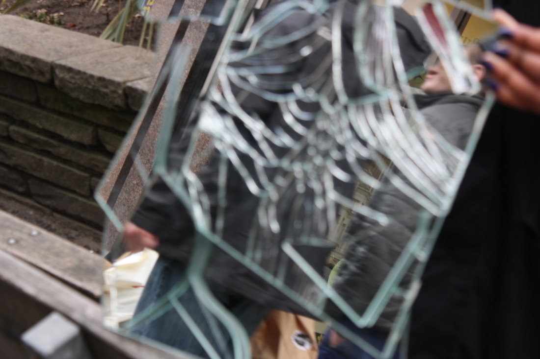
Despite being fond of the idea of mirrors and 'reflections' I have discovered through my previous digital response that distortion is very appealing to me. I am interested how different objects distort images, whether it be through water or as before: a smashed mirror. The reason as to why I like the idea of distortion is because I find it interesting in deciding what to leave outside of the distortion and what to include within the distortion. Thus, I shall play around with this idea for my next digital response as I look at the distortion which water creates. I have opted to complete the set in black and white as I believe the focus is then on the image rather than really bright loud colours dominating the photograph. However, I have included mirrors within the images, I have laid them out on the table to create a reflection, in keeping with my previous set.
The image below really inspired me for this set because all of the different distortions, shadows and reflections going on allow diversity and depth to the image, I also believe the black and white effect creates a very fine finish. The contrast of this photograph also works very well with the black and white theme as every detail appears sharp and defined.
The image below really inspired me for this set because all of the different distortions, shadows and reflections going on allow diversity and depth to the image, I also believe the black and white effect creates a very fine finish. The contrast of this photograph also works very well with the black and white theme as every detail appears sharp and defined.
What went well: I am very please with my outcome to this digital response due to the successful varying distortions created through different forms of glass. In addition, the reflections in the mirror create a slight illusion where the viewer is likely to question which subject is the reflection and which is real life. I do believe that the images worked best in black and white as each section is more focused and sharpened with harsh blacks and whites.
Even better if: To improve this set of images I believe focusing on reflections and distortions more could have been interesting. Although this is present in a few images I believe that when the distortion in life is different from the distortion in the reflection several different inside, outside and in between types of scenario are created, for example which is inside the mirror and which is outside.
What's next: Despite being happy with this digital response I have decided throughout this development that the broken mirror idea works best as the distortion of genuine people on the street creates genuine and natural images which do appear slightly freaky. Also, with reference to the exam theme I am interested in playing with what I decide to reflect and what the surrounding is, hence I may decide to contrast the inside world within the mirror and the outside world which is not in the reflection.
Original Images


Edited Images
Decision to develop cracked mirrors:
Having experimented with a separate form of distortion, I have concluded that smashed mirror distortion is the idea which I am going to focus on in developing a project. The reason as to why I have arisen to this decision is because I am extremely curious and interested in the idea of creating two different worlds through mirrors: the actual subject on the outside appearing usual and the distorted image displaying a dark, slightly odd and unusual place.
As a result of this conclusion, next I shall focus on developing a set in natural bright setting where there are highly saturated colours as it was clear from my previous experiment with cracked mirrors that the stark contrasting colours work best.
After this development I want to explore the use of the studio in this theme of research as I will then be able to decide whether natural or an unnatural setting works better in pursuit of my cracked mirrors idea. I will have my models wear bright red tops to create a stark contrast within the photograph because this is a main theme in my images: a studio setting will be useful for this because the surroundings will be black: red and black contrast sharply. Furthermore, this set of images is influenced by the colour use in Tracey Moffatt's series 'Something More.' Having researched the Australian artist I have become very keen on the use of saturated colours within the photographs and how certain parts of the image are more eye-capturing than the rest, yet all complement each other: this is the type of scene which I am trying to create. I also want there to be slight shadows in the images to create a 'dark' effect, and thus I shall use the studio lighting to create this look which I am aiming for.
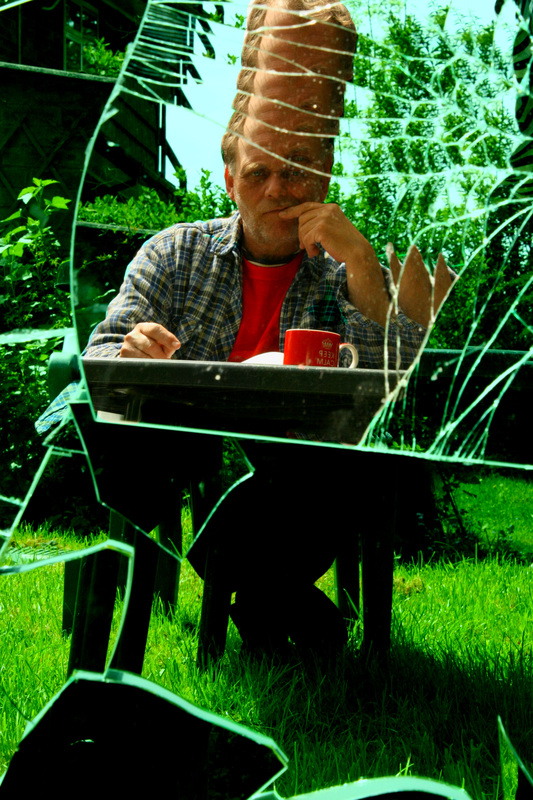
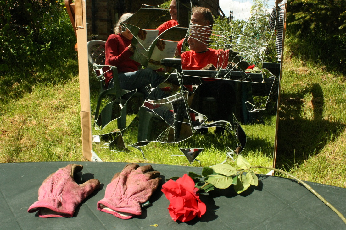
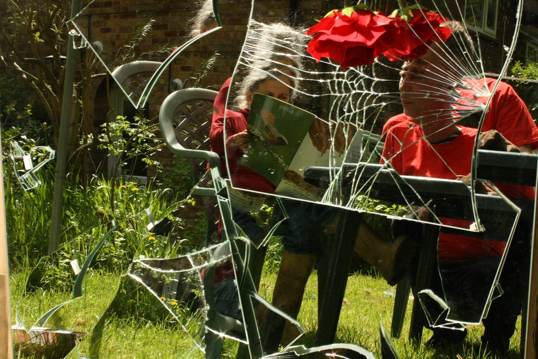
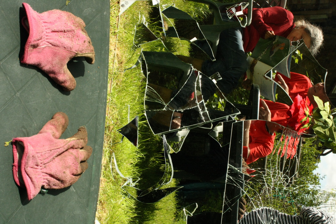
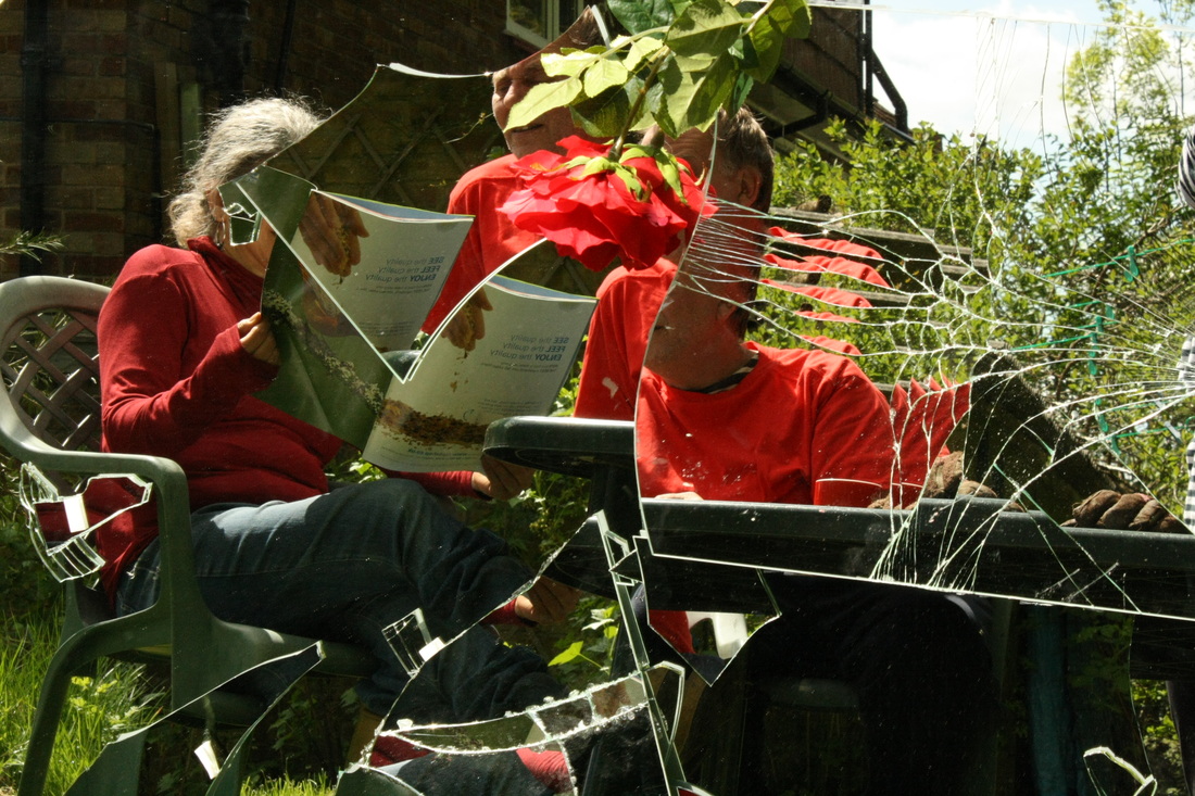
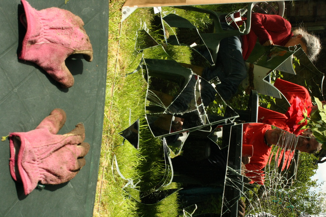
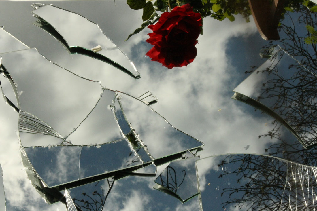
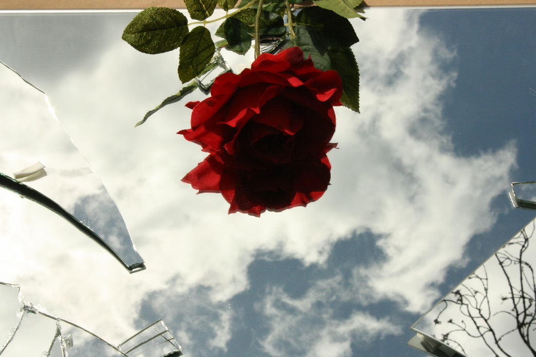
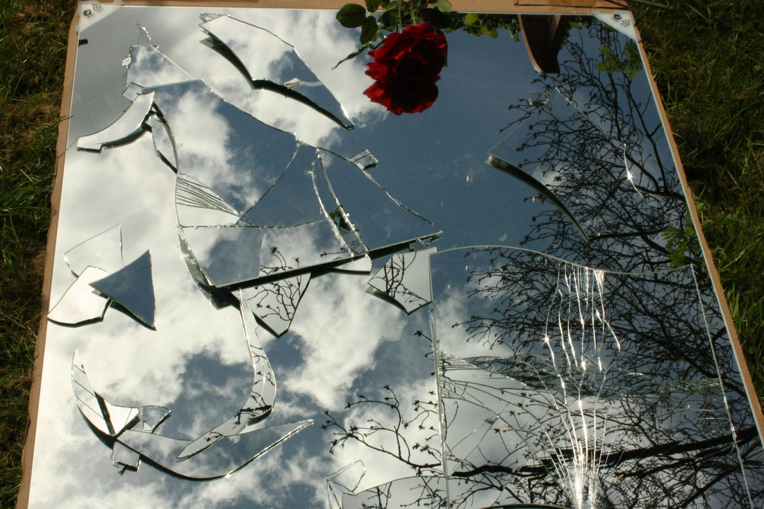
Reflections - Development
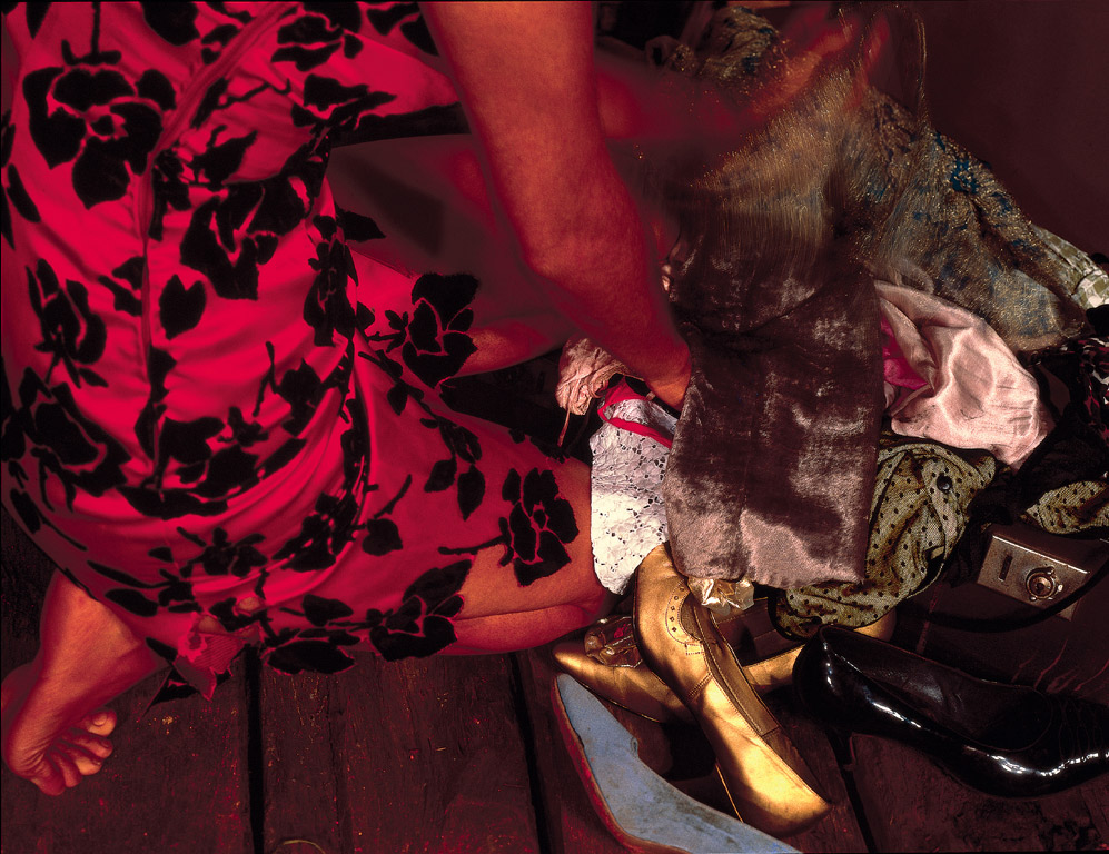
For my next development I have chosen the setting of a garden as the colours are brightly captivating and stark. My subjects are wearing bright red tops as this is a main theme within. I took photographs of the a big mirror which was distorted and I included the surroundings of the mirror in some photographs, but in the edits I cropped this because I wanted to show the distortion only. I had my subjects do everyday normal things including chatting, reading and drinking to create as genuine image as possible; I want to decide whether natural works better than natural in this case. After selecting the photographs which I found most effective I edited them on Photoshop to enhance the bold colours in the photograph and then adjusted the colour balance, contrast and brightness.
What went well: I am pleased with the overall outcome of this set because I feel that I have achieved my aim of producing a highly saturated, natural set of images with the use of a cracked mirror. I have found in this collection that red works extremely well in the reflection and thus this is something I will carry on through my developments. I also have found that red and green work well together thus this is also something I shall consider using in later developments.
Even better if: To improve this set of images I have thought about showing my subjects from different angles rather than one; similar to Picasso's cubism. This is because I want to show both the person looking into the mirror into reality as well as their reflection because this approach is far more in depth and relates more to the idea of an inner turmoil.
What's next: Next I shall take photographs in the studio with the cracked mirror, I want to experiment with whether a unnatural background so that I can conclude which gives a better effect. After this I am then keen to try photographing ideas which are similar to Braque's and Picasso's cubism, thus I am interested in noting whether a natural or unnatural background will be more effective for this.
Original Images:

Edited Images:

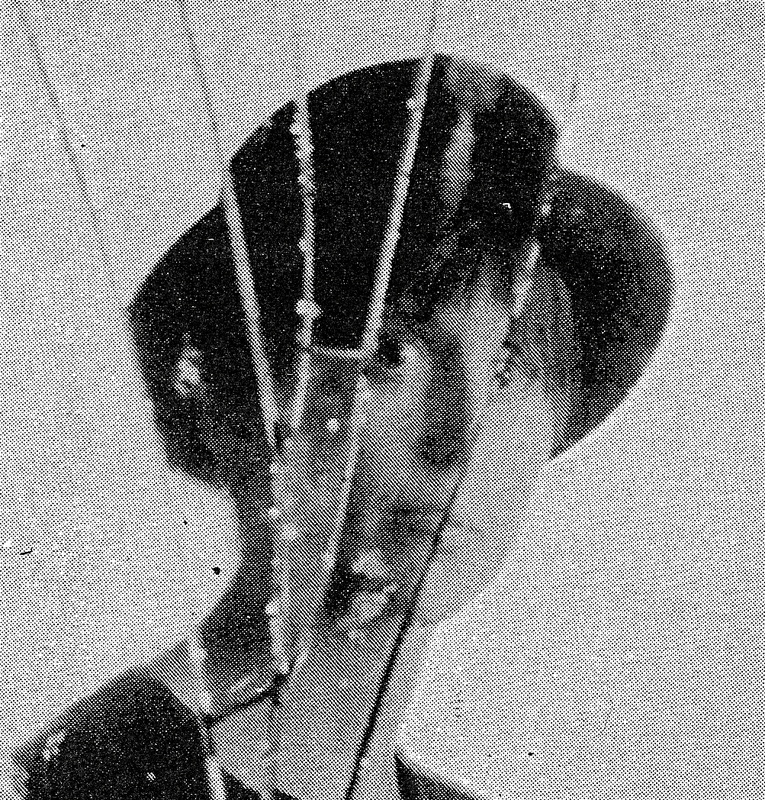
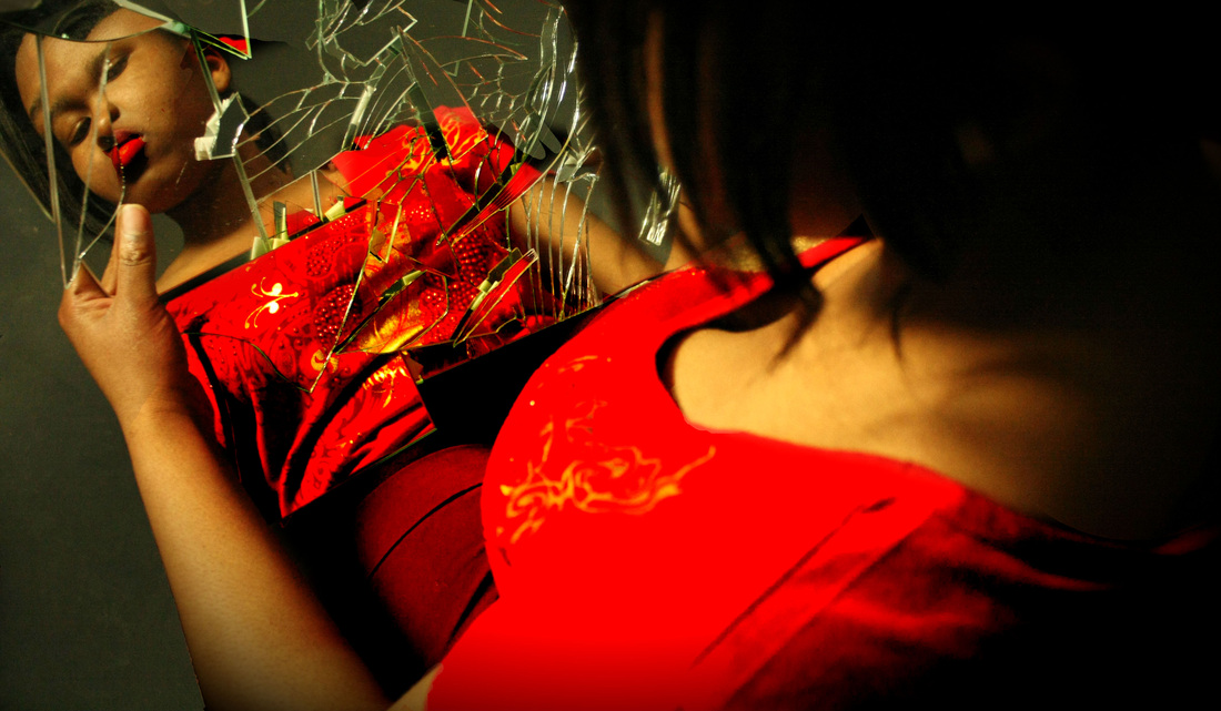
Katie Thompson: Research
Katie Thompson is a fashion portrait photographer from Illinois who produces imaginative and always beautifully lit photography. The images above were completed within a series of images she had been doing on mirrors and reflections. Thompson has always bee interested in the idea of self-perception and body image,thus she has experimented with different ways of visually showing this concept. In the images above she admits to wanting to show a distorted perception which appears more minimalistic, through carefully placing mirror to reflect the model's face. As a photographer she is interested in fashion and beauty photographs and thus wanted to create something that was still beautiful but had the hint of a darker undertone. Above are two photographs from her series 'reflections and mirrors.' To set up the studio for these images Thompson found some different sizes of round mirrors with another mirror that she could shatter, then glued them to a white board. To allow a distortion she propped the mirrors slightly on top of each other and then shot into the mirrors standing directly next to the model. Below are some of the images from her collection 'mirrors and reflections.'
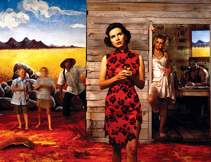
Tracey Moffatt: Research
Tracey Moffatt is an Australian artist who primarily uses film and photography in her work. Moffatt's first real taste of the spotlight came from her series 'Something More,' - this is the series which has inspired me for my next set. In the photograph above on the left, Moffatt stands just of centre in the frame wearing an Asian dress which is set against a hut in which a woman in a dirty white dress leans against the door frame. Moffatt's image seeks to disturb meanings of cultural identification while questioning the authenticity of the presentation by reinforcing its own 'fake' construction. Within the two images above brightly saturated colours are used, especially on the dress which Moffatt is wearing - this draws attention to her immediately above all else. It could be argued that Moffatt wanted to illustrate the femininity of herself in addition to the rural countryside to show her dreams contrasted with the reality in which she is, hence why the focus is on the feminine dress: this is the case in both of the above photographs. The Natural Gallery of Australia expresses this point as they wrote, "'Something more' has the style of a set of stills for a film about the trials of a poor but restless ‘coloured’ girl in rural Australia who wants ‘something more’ out of life than her lot in the back-blocks."
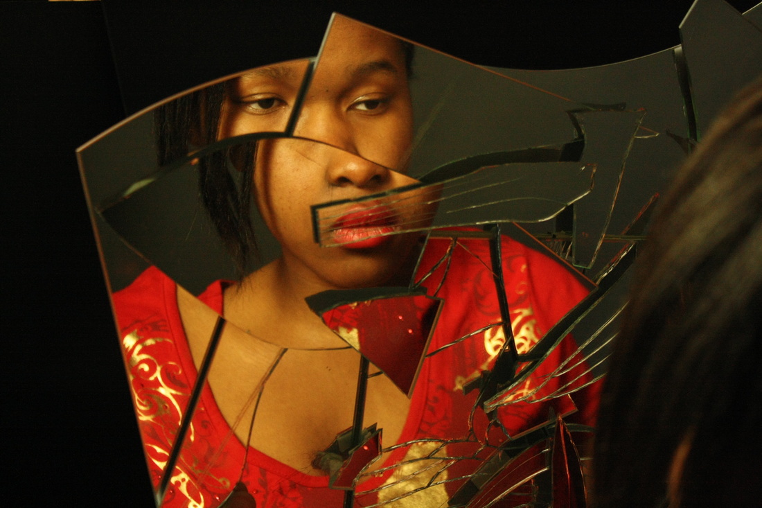
This next set of photographs has been hugely inspired through the work of both Katie Thompson and Tracey Moffatt. I have given the distorted reflection a more beautiful appearance through the use of deep saturated red colours which were inspired by the work of Moffatt in hope of gaining a glamorous look; red is often associated with glamour and fashion, hence my use of it. Thompson also inspired this set as I concentrated on the facial features more precisely and when constructing my broken mirror I used her method of layering the mirror pieces to gain a more exaggerated distortion.
What went well: I am very pleased with my outcome below as the highly saturated red colours are very loud and noticeable - this was the effect I wanted to create. In addition, I am very interested in pursuing the effect which the lighting created within my photographs; the dark shadows are mainly set around the edge of the photograph, this creates a slightly 'spooky' effect. However I did enhance this effect with Photoshop, I also increased the colour intensity of the red tops to make them very bright and powerful.
Even better if: To improve this set of images I believe I need to focus on what is included in the frame and what is left out. For example, in some of the photographs I would like to try and get more of the back of the subjects head in and a more direct view of the mirror reflection. I also could have experimented even more with shot type, for example, taking a photograph from above - I did experiment with this to some degree as most of the images are at a slant from above.
What's next: Next, I have decided to continue with the same theme but I shall experiment with more mirrors in attempt to show even more sides of the face. This shall create an interesting set of reflections as one will also be a reflection in the cracked mirror; resembling the idea of distortion and reflection.
Original Images
Edited Images
Reflections - Development
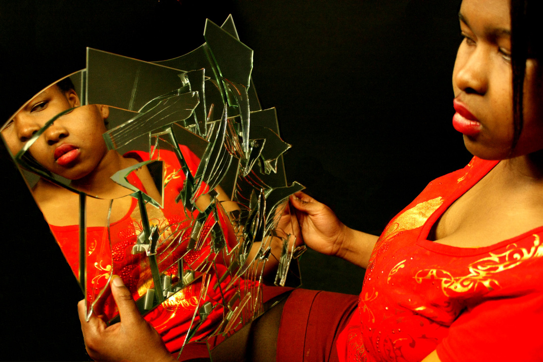
To develop the idea of distorted reflections further I have decided to look at the work of Pablo Picasso who was a huge feature of cubism. The reason I have decided to look at cubism is because within my distortions I am showing often two sides of the subjects face, however I am keen to show several sides of the face, thus creating even more reflections as this would create a further distortion, thus because cubism looks at how to compose almost all sides of the face in one image I believed this related hugely. Because the mirror is smashed I also wanted to show how everyone has a distorted inner self despite what is seen on the outside: although from all other sides the individual may look usual and ordinary, inside the distorted mirror illustrates their true self and that everyone has an inner turmoil. Thus although I am not replicating Picasso's work completely, it does have a very similar idea of wanting to illustrate several sides of the face and thus photographing from behind I aim to achieve this.
Braques and Picasso: Cubism Research
Pablo Picasso is the extremely well-known Spanish painter, sculptor, print-maker, ceramicist and stage-designer of the late 19th and mid 20th centuries. Within the early days of cubism, historians would relate this to Picasso due to his paintings of depicting human figures, through making use of several viewpoints: this is a key feature of cubism. In addition, Georges Braque's also had a similar style in approaching his art; the French sculptor and painter developed the idea of cubism along with Picasso. Braque's ideas were reflected in his work about geometry and simultaneous perspectives. He committed to studying the effects of light and perspective and the technical qualities behind them, this questioned the most standard and artistic conventions. He often tried to break down the geometric approximations for a cube and looked at shadings and depths as he was curious about how to adjust the shading of a 2D shape to make it appear both 3D and flat through fragmentation. Similarly, Picasso later went on to focus on analytical cubism which involved focusing on a mundane, uneventful, often still object which he then deconstructed, dissected and reconstructed in a way which shows it's essence rather than appearance: he did this together with Braque's. Pablo Picasso and Georges Braque's both moved towards abstraction, leaving only enough signs of the real world to supply a tension between the reality outside the painting and the complicated meditations on visual language within the frame.
Overall, the key aim for the cubists was that in a painting or photo the perspective within is limited: this is a barrier which they aimed to break down. Because an image is drawn from a particular direction their perspective was limited and frozen; they wanted to reach beyond the geometrical perspective. Thus Picasso and Braque's examined the way the human eye views things. The duo composed a thesis that the eye scans around, stopping to note certain details before carrying on to the next point of interest. Thus, viewpoint can change in relation to the object allowing one to look above, below or from the side. As a result, Cubists proposed the idea that sight of an object is the sum of many different views: not a single glance and viewpoint. Cubist painting was thus a paradoxically abstract in form, and was an attempt at a more realistic way of viewing things.
Overall, the key aim for the cubists was that in a painting or photo the perspective within is limited: this is a barrier which they aimed to break down. Because an image is drawn from a particular direction their perspective was limited and frozen; they wanted to reach beyond the geometrical perspective. Thus Picasso and Braque's examined the way the human eye views things. The duo composed a thesis that the eye scans around, stopping to note certain details before carrying on to the next point of interest. Thus, viewpoint can change in relation to the object allowing one to look above, below or from the side. As a result, Cubists proposed the idea that sight of an object is the sum of many different views: not a single glance and viewpoint. Cubist painting was thus a paradoxically abstract in form, and was an attempt at a more realistic way of viewing things.

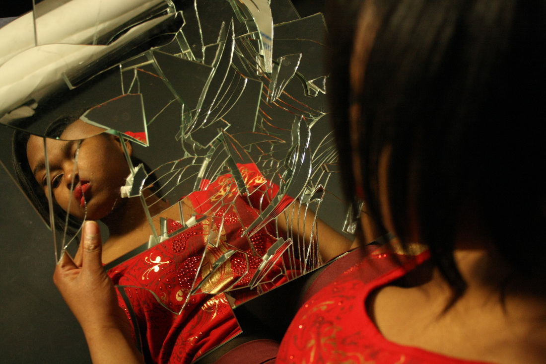
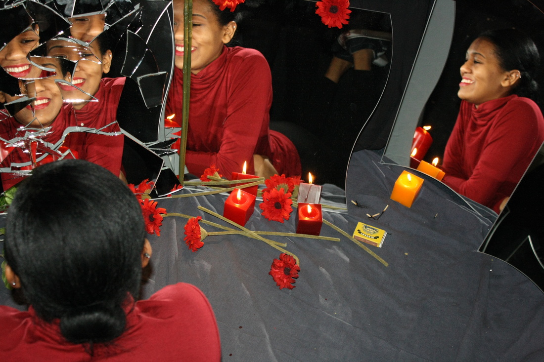
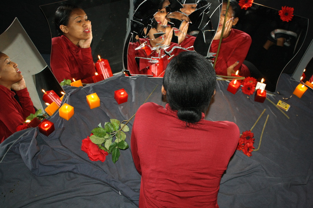
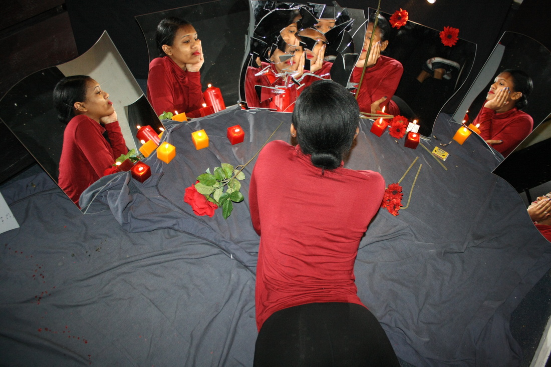
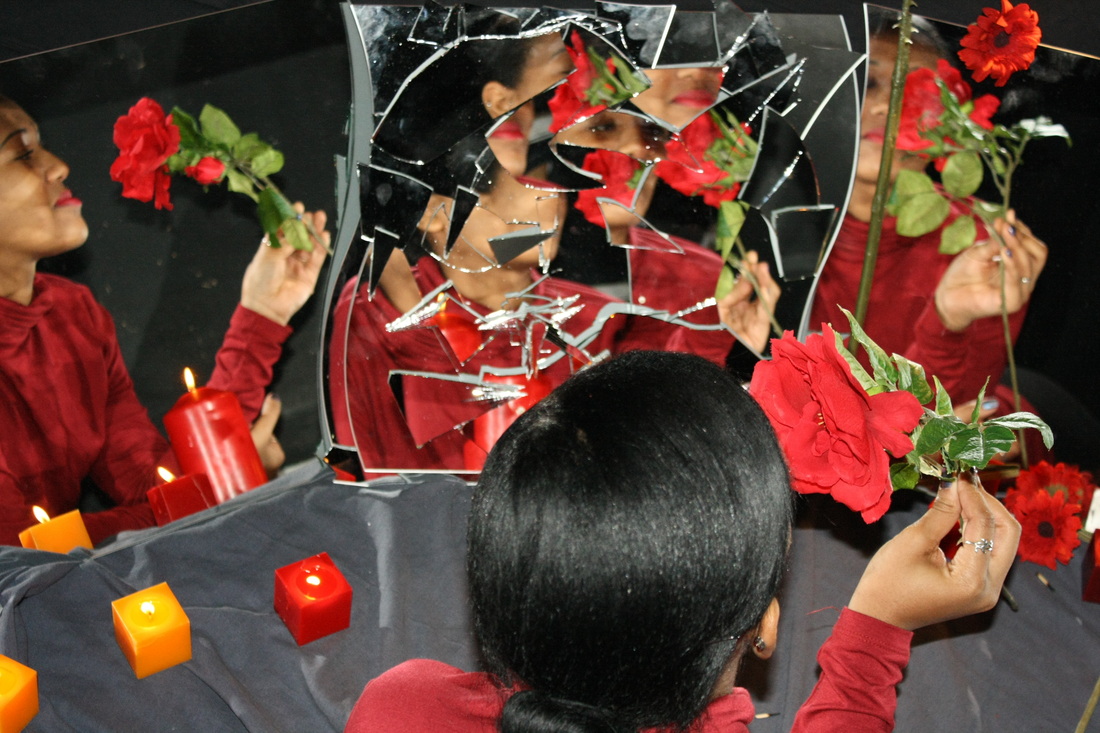
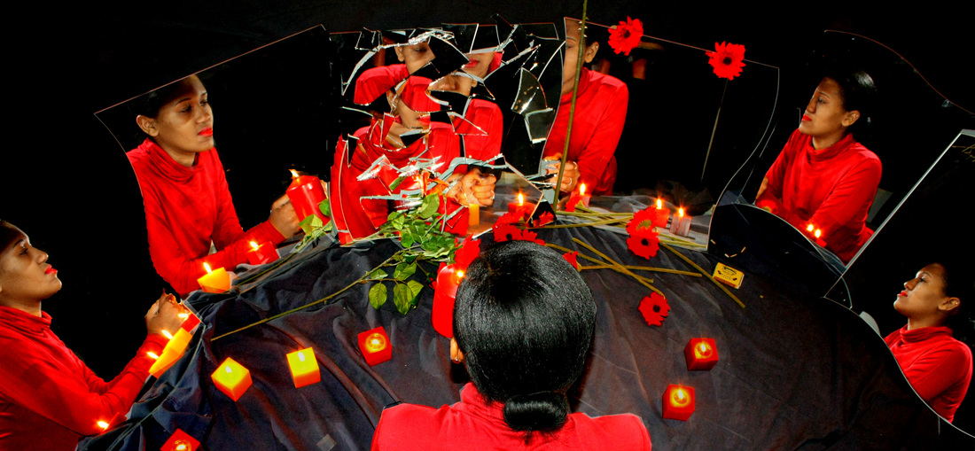
My next digital response to reflections and distortion is therefore based upon Picasso's idea of cubism; I am trying to capture as many sides of the face as possible through the different reflections in mirrors. However, I am going to continue the idea of distortion and thus one of the mirrors within this set shall be distorted. This will illustrate to a greater extent how on the outside someone may appear mundane and ordinary, yet on the inside is fragmented and different, because the more mirrors which are not distorted illustrating the model to be ordinary and then the distorted one in the middle is a sharper contrast due to the larger volume of mirror.
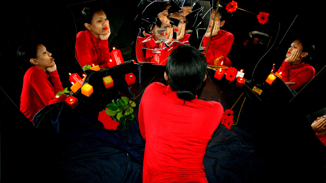
Within this digital response to reflections and distortion I decided to create an all black setting where I dressed my subject in red and put red props around including deep red flowers and brightly lit red candles. I then took the photographs from above in attempt at capturing as many sides of her face as possible. Because this was not a studio setting the lighting was a difficulty as often sides of her face were more shadowed than other parts: it was quite uneven. When editing my photographs in Photoshop I decided to enhance the saturation of the photographs to a large extent as red is a key feature of my over all developing collections.
Although in previous sets I had concluded that the studio gave better results for the type of image I was aiming for I felt that the candles would have given a better lighting on the models face and would have made up for the artificial lighting which one would get in the studio, however it is clear from this set that this was not the case, thus in my next final development I shall definitely shoot inside the studio.
What went well: I am pleased with the idea of reflecting several sides of the face as it creates the illusion of seeing several inside worlds, the possible idea of parallel universes comes into play as there are several reflections of the same person but from different angles.
Even better if: To improve this set I definitely shall use a studio setting next time to get a better spread of lighting across the subject, as this was a huge difficulty in this set. Also, I will consider using a natural outside environment for my final development as I believe photographing this is a bright surrounding with bright green trees and grass will create a highly colourful, eye-capturing image. I also do not think in this set that I achieved the idea of reflecting a distorted inner self as the models face isn't very focused but instead random in most shots: I will consider to a further extent the type of model I use in my next set as I think expression is an important part in this idea.
What's next: Next I shall photograph a similar idea in a studio, however I will not use as many props as I feel it makes the image appear crowded and draws away from the main idea. Thus the result will be slightly more bare but more focused on achieving the correct facial expression and lighting features as I am really trying to convey a distorted inner self despite appearing mundane on the outside.
Original Images:

Edited Images:
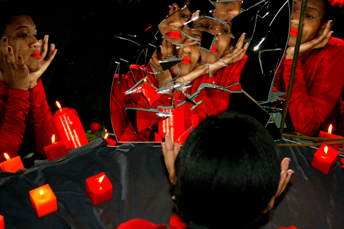
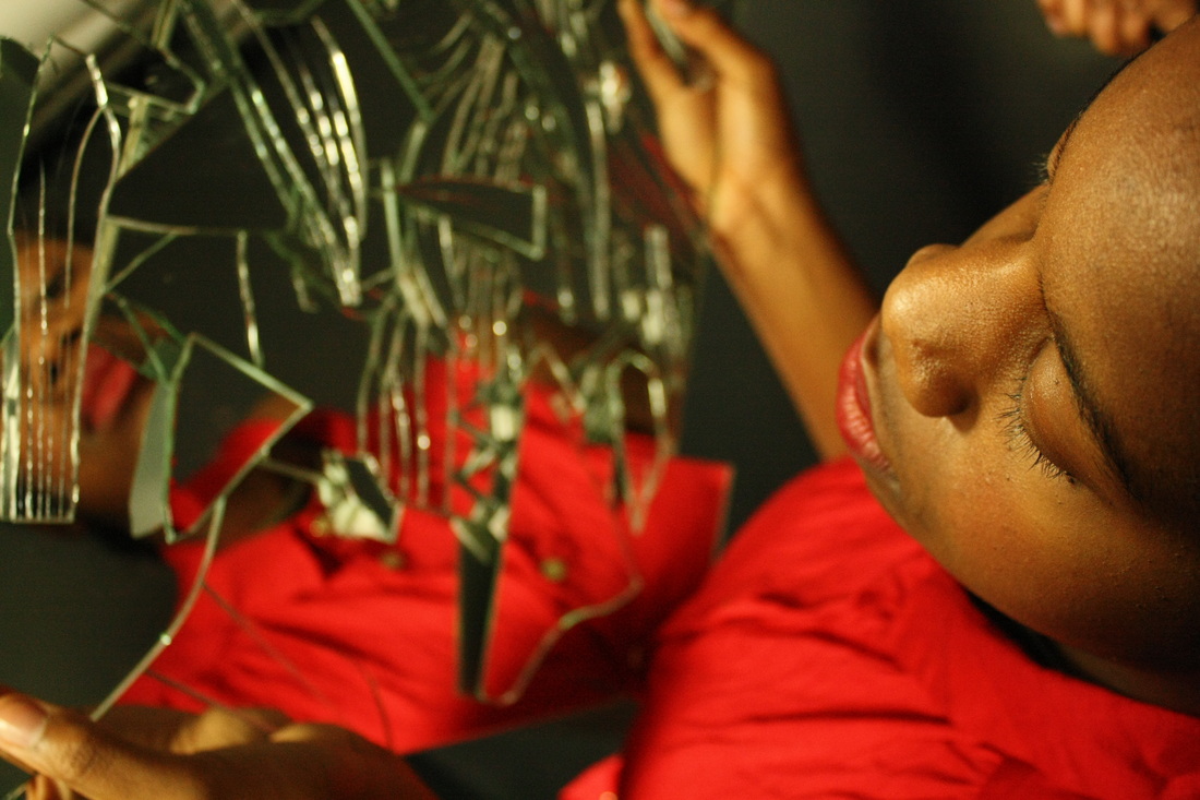
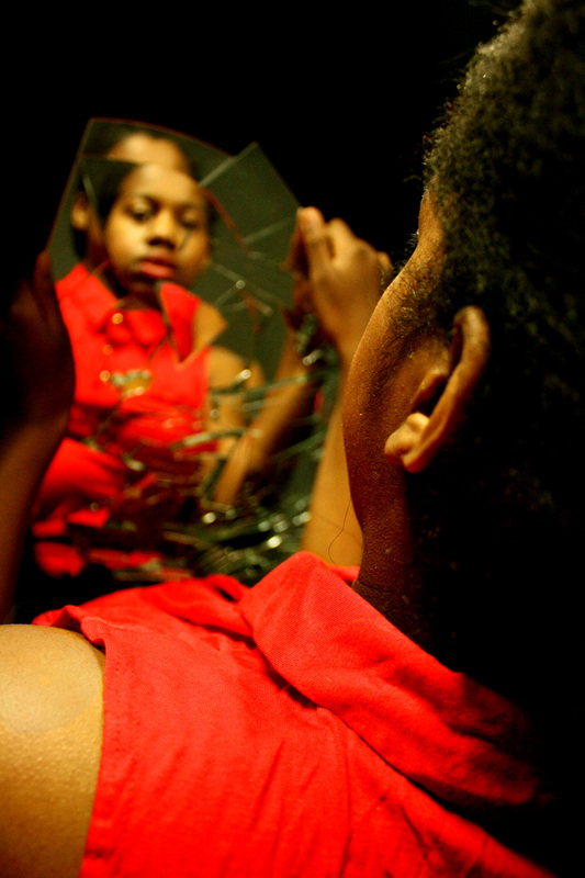
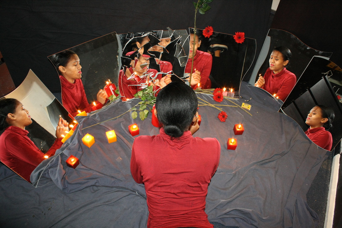
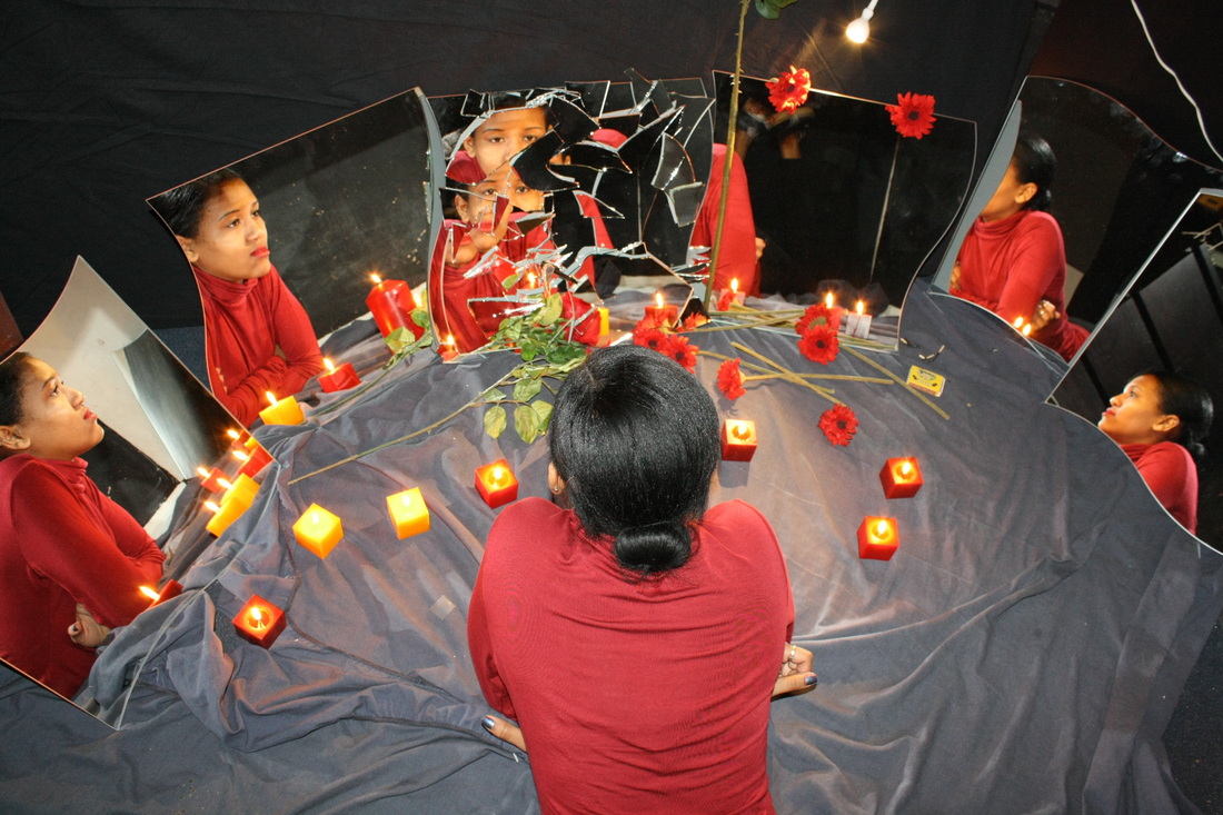
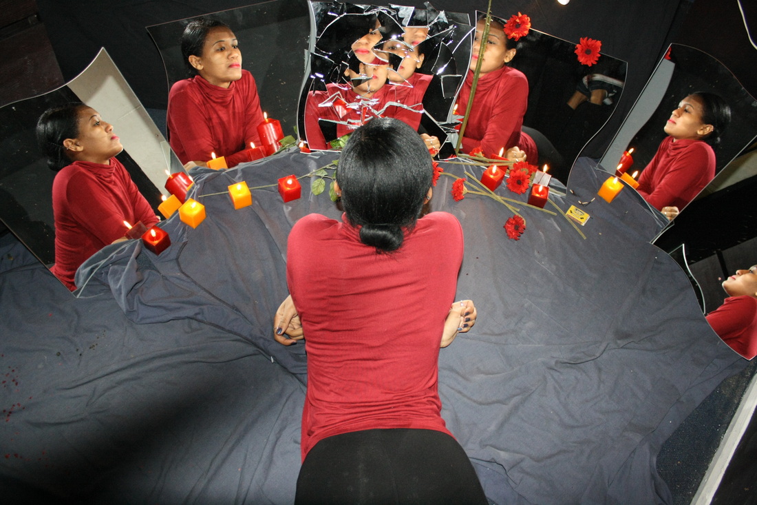
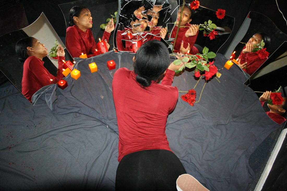
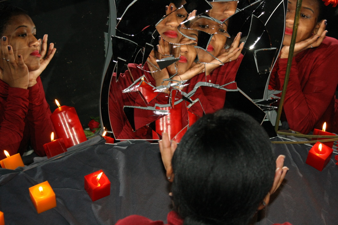
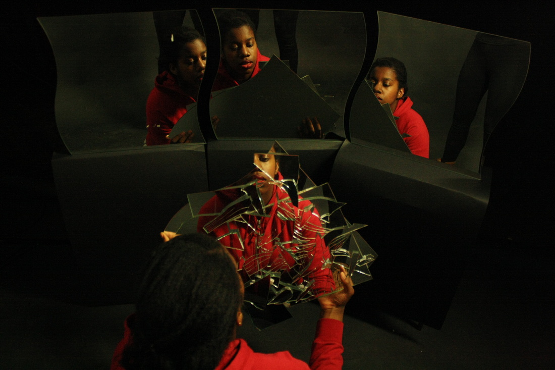
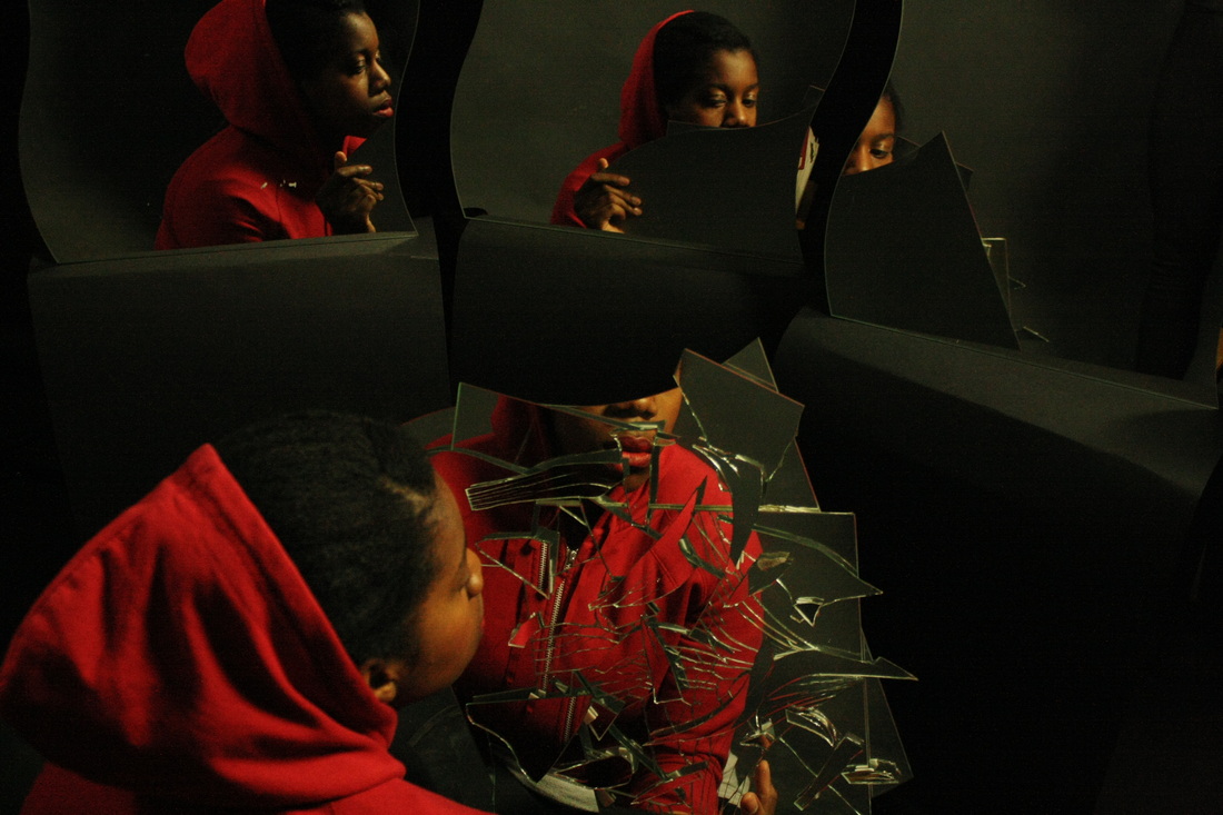
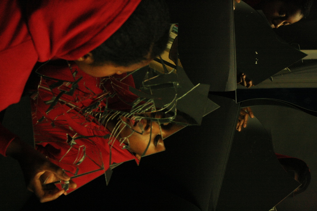
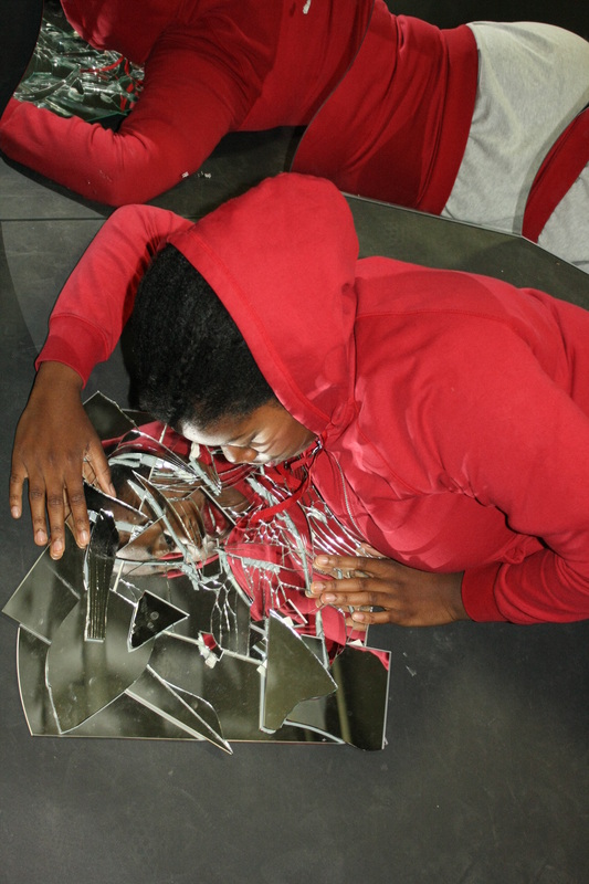
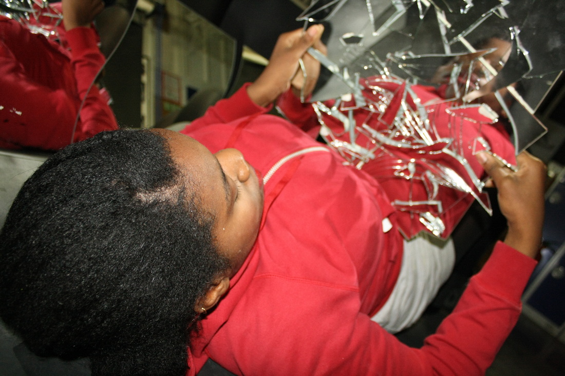
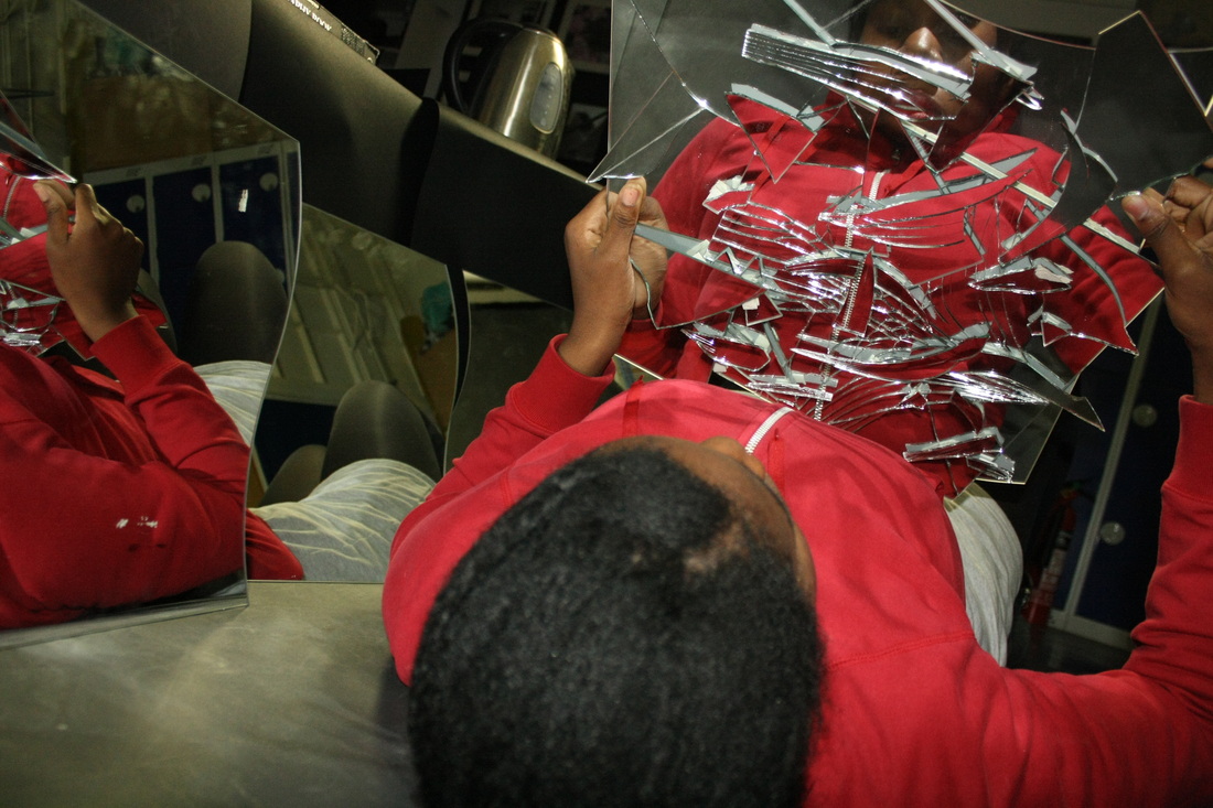
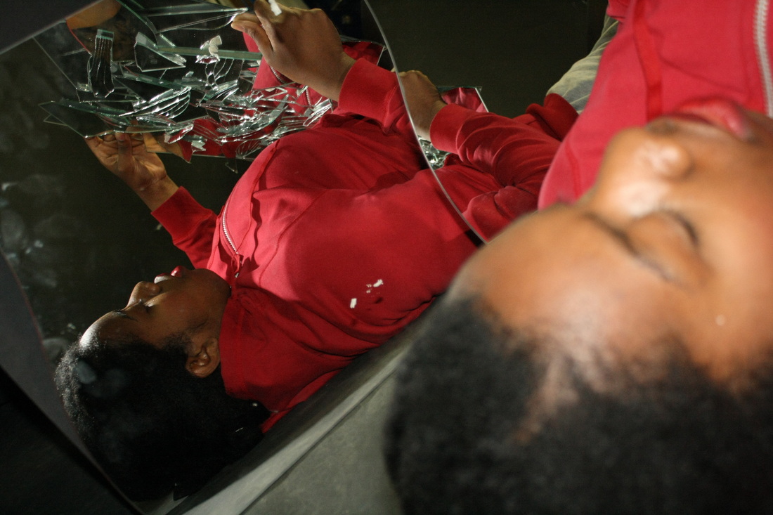
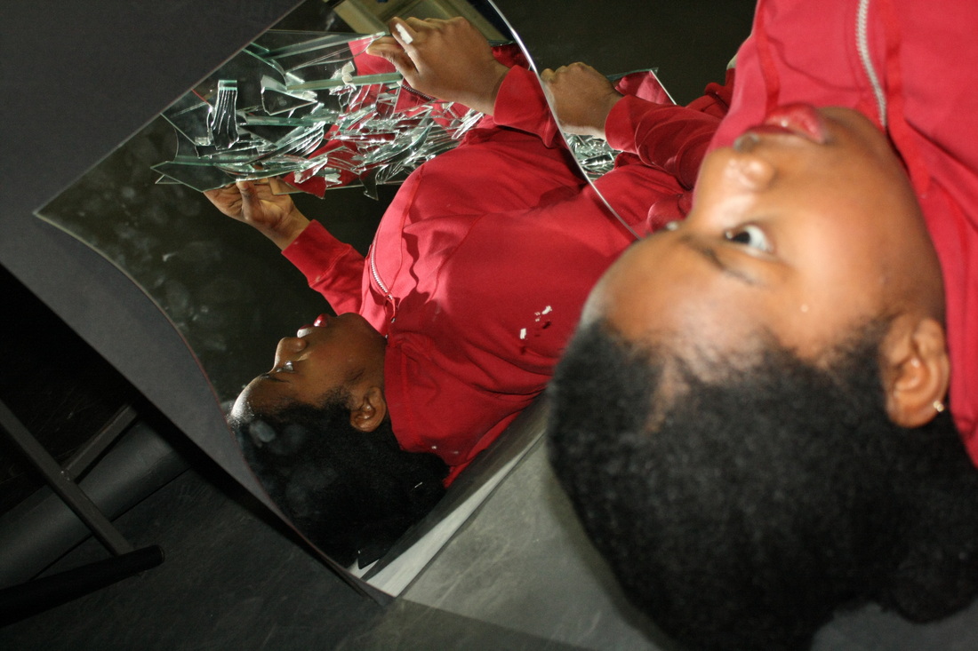
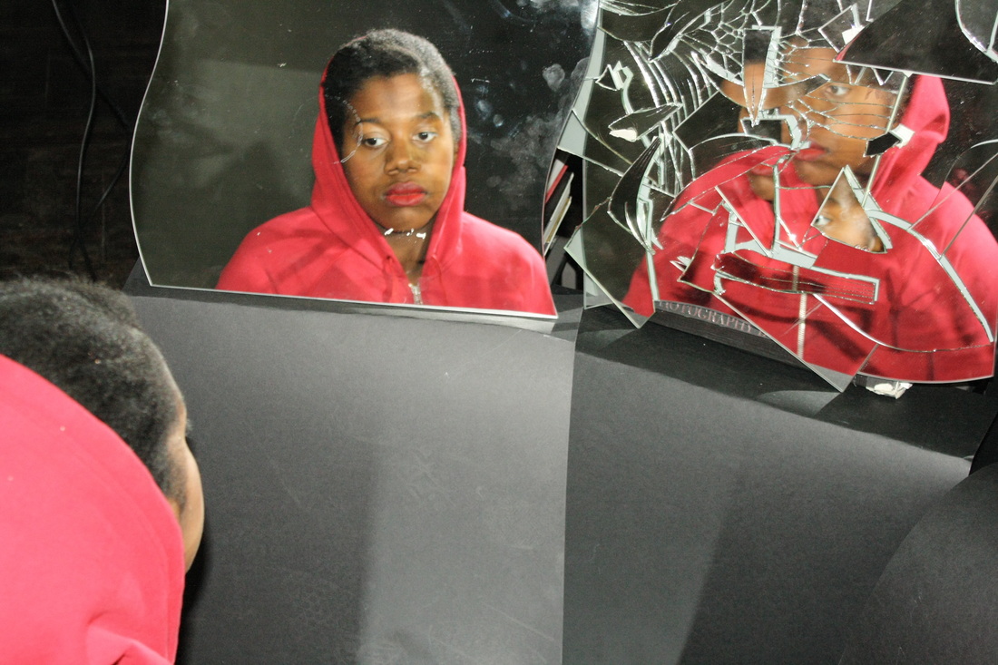
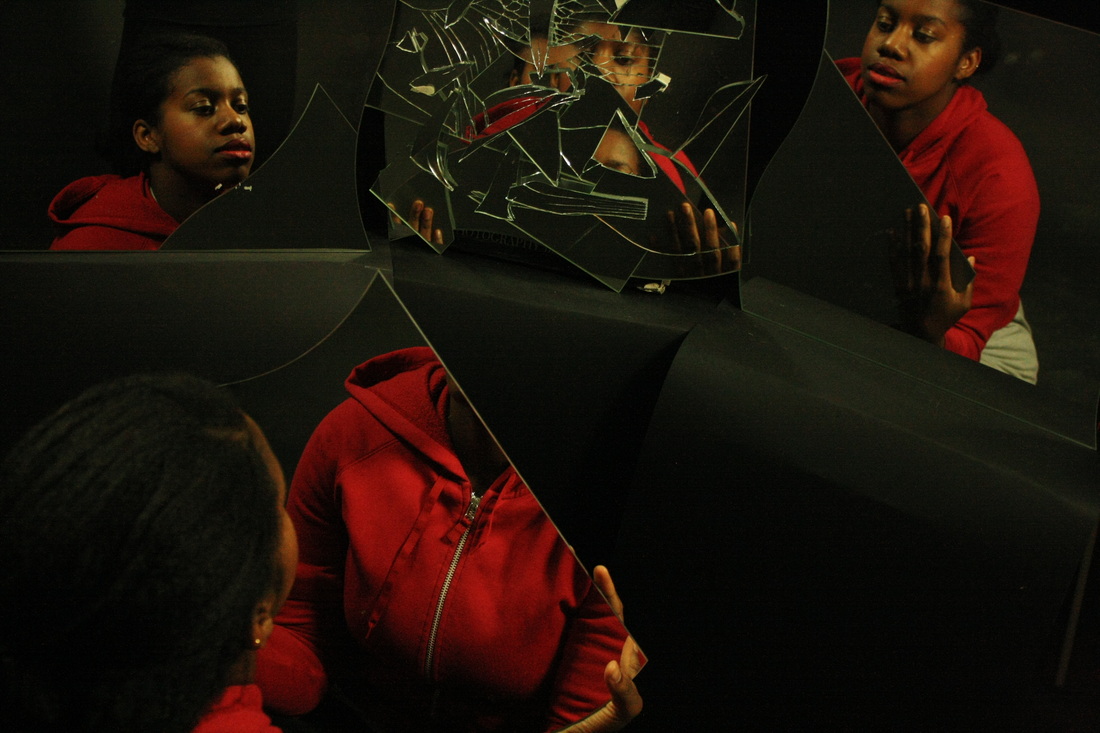
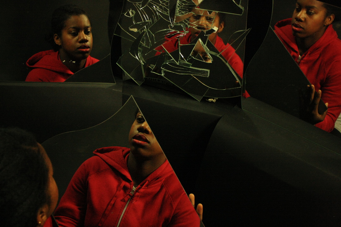
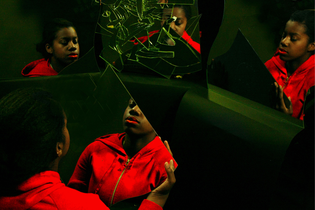
Reflections - Final Development
For this next set of photographs I decided to improve my previous set by using a studio setting with controlled lighting in order to create shadows in the image which I could influence more easily. In my previous set it was difficult to control the lighting as the setting was not in a studio and the shadows were a bit more random and less focused, this created half a shadow on some of the face whilst the rest would be light - thus the over all form appeared slightly rigid whereas I was aiming for a smoother outcome. Moreover, I have photographed my model in several different positions to get a wide range of photographs, then I selected the ones which I thought were best to edit. I enhanced the red in all photographs as I wanted this to stand out: it has been the theme for most photographs within this series. I alternated between my subject holding the cracked mirror and then in another holding a normal mirror: the reason for this alternation was because I wanted to discover which mirror I preferred her gazing into. I also took some shots which were not involved in the cubist idea: they were usual photographs with her face on the cracked glass and this being the only reflection.
What went well: I am pleased with this digital response as the outcome is far more focused on expression whilst still showing several sides of the face. I used different angles to construct this collection which gave a wide variety of photographs which I then narrowed down to a few photographs that were enhanced, contrasted and brightened. I am very fond of the bright green and reds in the photograph. I believe bright colours work much better than simply red and black because it brings more life to the image. I also found the photographs which only consisted of one mirror of interest as I was able to focus solely on a single expression rather than several which are more difficult to control due to the large volumes of different reflections. Also, being able to focus on expression will convey the inner distortion of peoples personalities which I was deeply aiming for.
What went well: I am pleased with this digital response as the outcome is far more focused on expression whilst still showing several sides of the face. I used different angles to construct this collection which gave a wide variety of photographs which I then narrowed down to a few photographs that were enhanced, contrasted and brightened. I am very fond of the bright green and reds in the photograph. I believe bright colours work much better than simply red and black because it brings more life to the image. I also found the photographs which only consisted of one mirror of interest as I was able to focus solely on a single expression rather than several which are more difficult to control due to the large volumes of different reflections. Also, being able to focus on expression will convey the inner distortion of peoples personalities which I was deeply aiming for.
Original Images:
Edited Images:

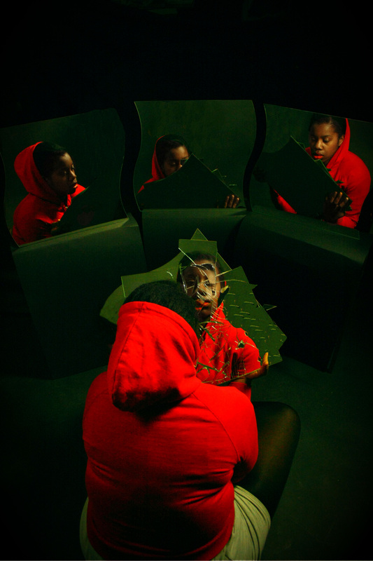

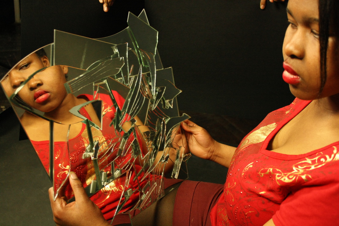
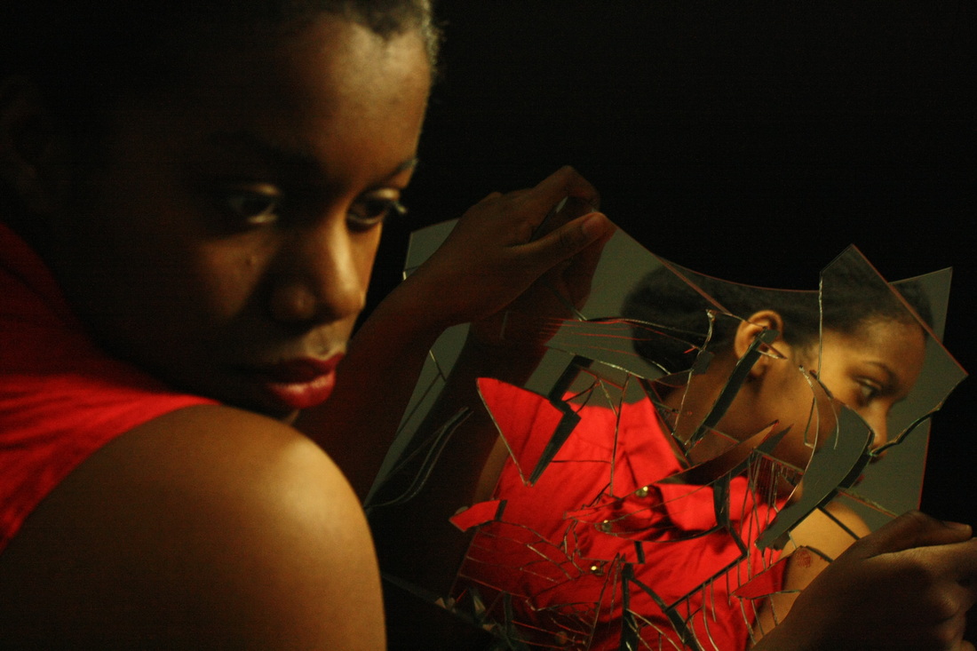
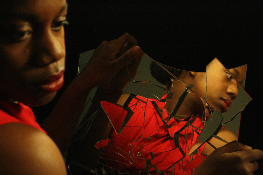
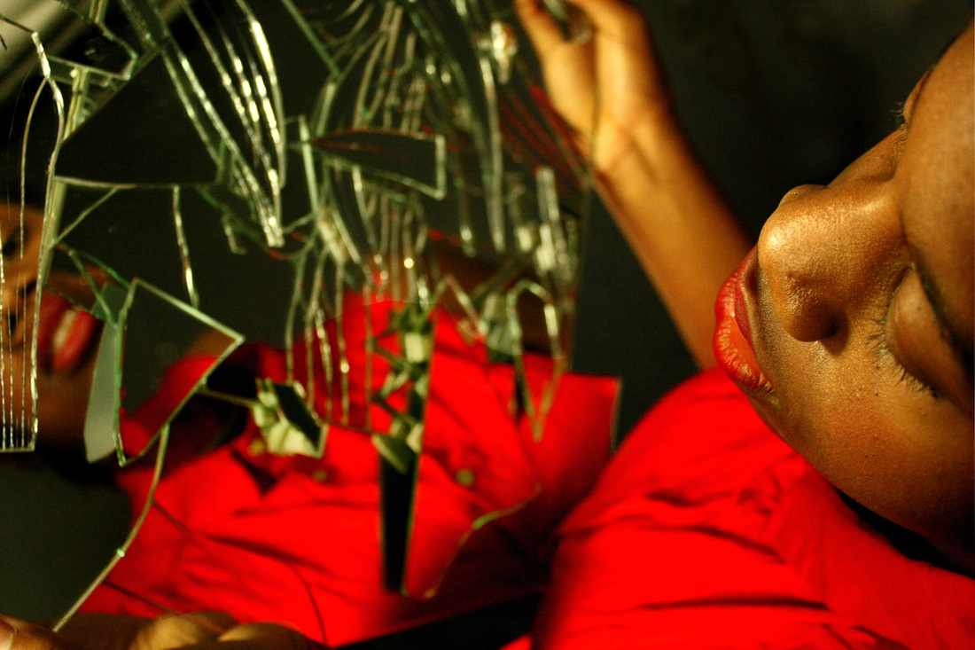
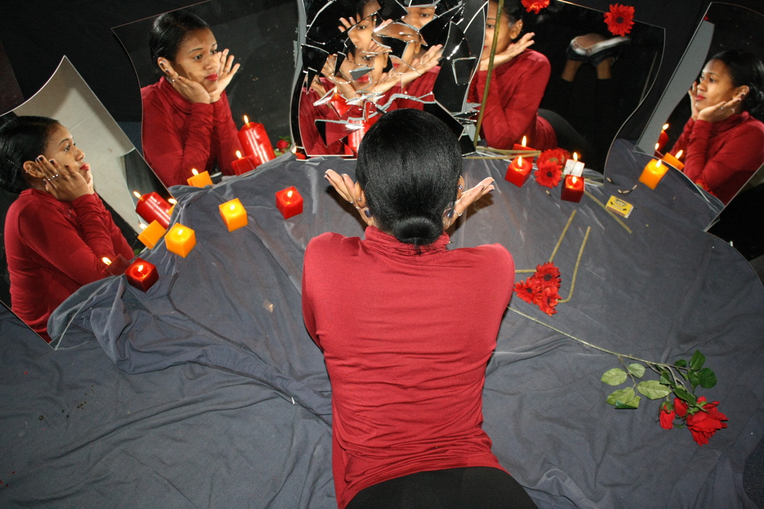
Final Outcome:
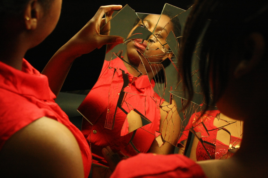
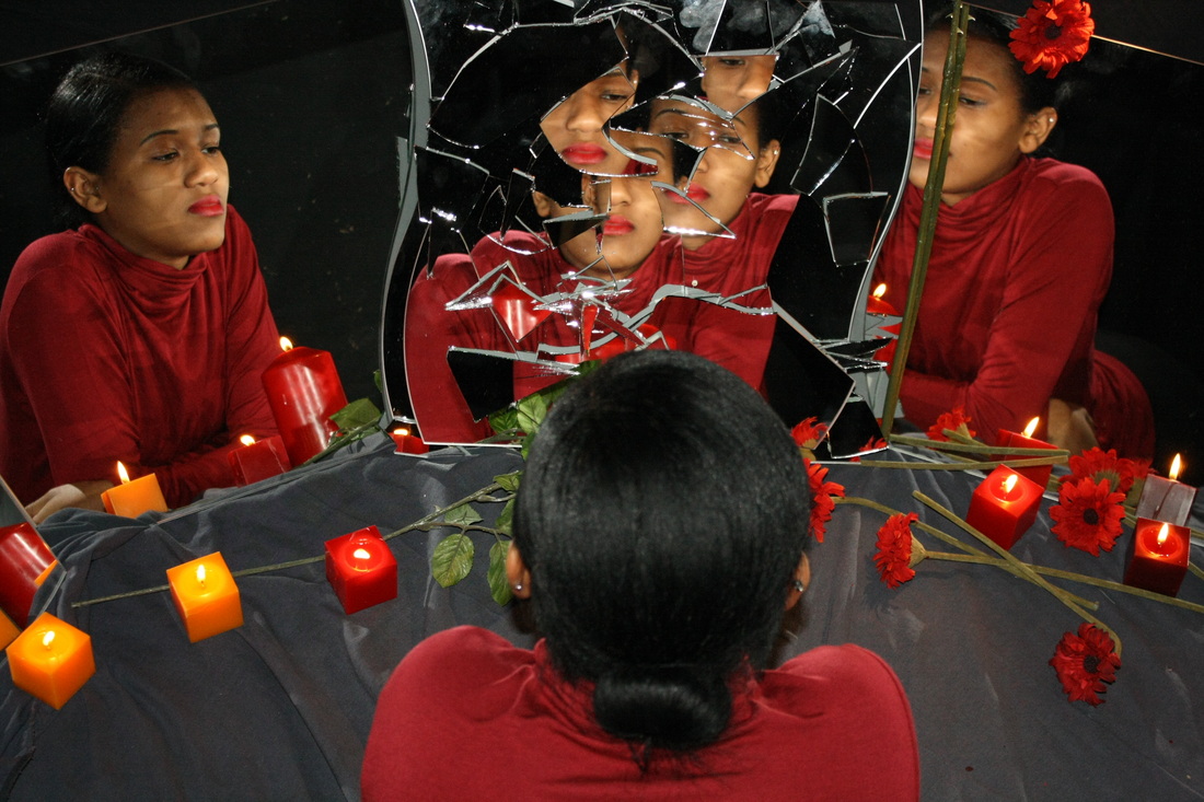
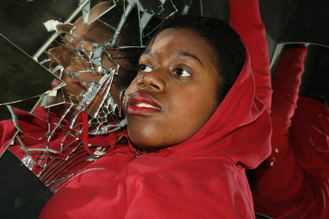
For my final outcome I structured a shoot within the studio of my model wearing a bright red top and lipstick to create the highly saturated effect which I have been aiming for throughout. I chose to shoot my final piece in the studio because I have discovered through my development collections that due to my need for even lighting and shadowing in specific places this is very easily created with artificial lighting against a black background in the studio. I chose to use a black background again because I want to focus on the models expression in each mirror. Despite being pleased earlier in the project with outcomes outside, my personal focus was to capture expression and a deep photograph which didn't have objects around it drawing away from the focal point of the image. However, there was a set of photographs which I created earlier on within this process which were in a garden with bright greens and reds, because this was such an effective piece I decided to incorporate some green within my final piece due to the success of the other set.
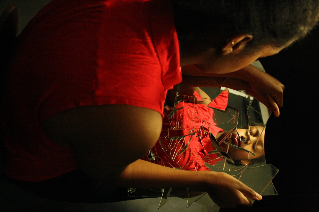
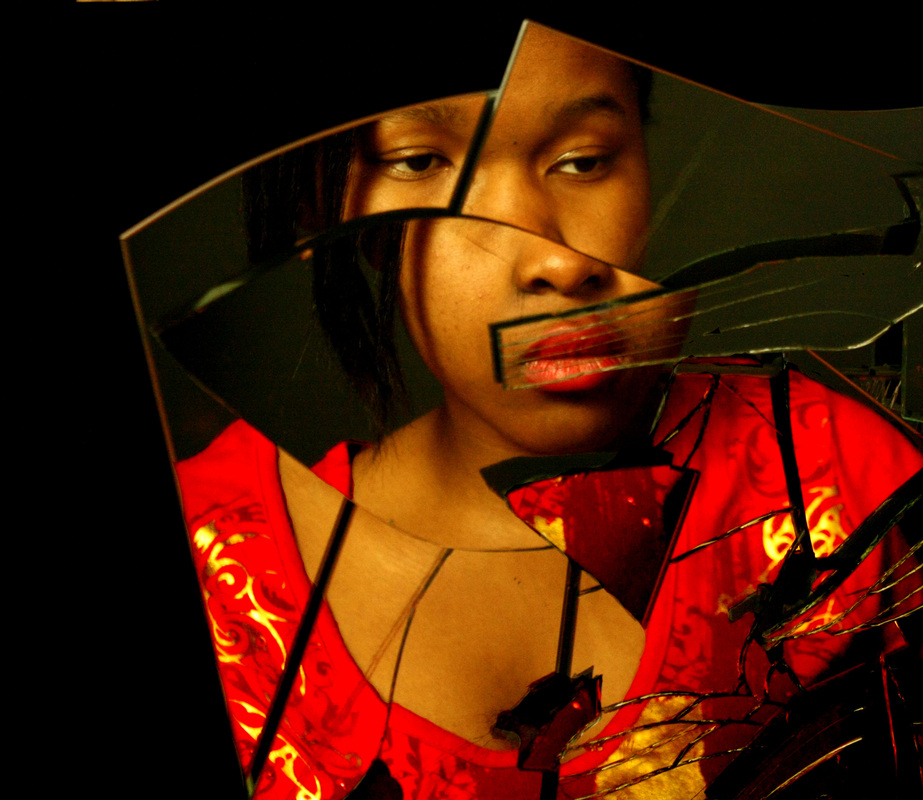
Moreover, I then shot images from different angles to create a variety of different photographs which I could then select my final outcome from. I edited four images which I thought illustrated my work and ideas most thoroughly, each was from a different perspective or had a different approach about it: some landscape, close-ups, long-shots and birds-eye view. I edited these photographs in Photoshop whereby I adjusted the brightness, contrast, saturation and colour balance of the image. I have learnt throughout this process that the red contrasting with the other colours and shades in the photograph is very important for me to achieve the effect I want. In this set I was aiming to achieve Picasso and Braque's cubist effect whilst at the same time including the bright contrasting colours which inspired me from my research of Tracey Moffatt. I believe I was very successful in achieving this aim as I am showing nearly every side of the subject's face in the photograph I picked for my final outcome; this was one of the most successful photographs due to the different perspectives of the face apparent. The decision to use the photograph below as my final piece was also influenced by the idea that you can see both inside and outside the mirrors; outside it is notable that the model is holding the mirror up whilst inside the mirrors she is looking at completely different angles. With use of the distorted mirror interesting shapes and effects were created as most of her face is obscured and uneven. It also clearly illustrates the key idea that everybody has an inner turmoil; through the cracked mirror as well as different sides of personality which is illustrated through the varying different perspectives of the model: what is displayed on the outside does not represent the inside of an individual. I have also decided to use another image for a joint final piece as I believe this image which was taken from an angle above allows the observer to think about the meaning of the photograph and note the 'inner fragmentation' which I conveyed. Also, in this image my subject is holding the distorted mirror, I wanted to illustrate the fragmented face to a further extent as this has been one of the main aims in this project. The green in this photograph is also defined very well as it seems to ripple into black through shading and shadows from the lights. The colours in my photographs have been very important throughout and this is why I have chosen these two pieces over the others as I believe they display and represent my over all work best.
Thus in conclusion, I am very pleased with my final outcome and shall print it out on matte paper before framing on a black mounting board to go on display. I shall also have a development piece which will be the photograph in the garden; I have decided to use this one because I believe it also shows strong expression through facial features, whilst also illustrating my use of bold saturated colours. It is a clear representation of an ordinary person having a darker inner self through the use of a mundane, everyday setting in the photograph.
Final Pieces:


Development Piece: